11 Predictive modelling and machine learning
In predictive modelling, we fit statistical models that use historical data to make predictions about future (or unknown) outcomes. This practice is a cornerstone of modern statistics and includes methods ranging from classical parametric linear regression to black-box machine learning models.
After reading this chapter, you will be able to use R to:
- Fit predictive models for regression and classification,
- Evaluate predictive models,
- Use cross-validation and the bootstrap for out-of-sample evaluations,
- Handle imbalanced classes in classification problems,
- Fit regularised (and possibly also generalised) linear models, e.g., using the lasso,
- Fit a number of machine learning models, including k-nearest neighbours (kNN), decision trees, random forests, and boosted trees, and
- Make forecasts based on time series data.
11.1 Evaluating predictive models
In many ways, modern predictive modelling differs from the more traditional inference problems that we studied in the previous chapters. The goal of predictive modelling is (usually) not to test whether some variable affects another or to study causal relationships. Instead, our only goal is to make good predictions. It is little surprise then that the tools we use to evaluate predictive models differ from those used to evaluate models used for other purposes, like hypothesis testing. In this section, we will have a look at how to evaluate predictive models.
The terminology used in predictive modelling differs a little from that used in traditional statistics. For instance, explanatory variables are often called features or predictors, and predictive modelling is often referred to as supervised learning. We will stick with the terms used in Chapter 7, to keep the terminology consistent within the book.
Predictive models can be divided into two categories:
- Regression, where we want to make predictions for a numeric variable,
- Classification, where we want to make predictions for a categorical variable.
There are many similarities between these two, but we need to use different measures when evaluating their predictive performance. Let’s start with models for numeric predictions, i.e., regression models.
11.1.1 Evaluating regression models
Let’s return to the mtcars data that we studied in Section 8.1. There, we fitted a linear model to explain the fuel consumption of cars:
(Recall that the formula mpg ~ . means that all variables in the dataset, except mpg, are used as explanatory variables in the model.)
A number of measures of how well the model fits the data have been proposed. Without going into details (it will soon be apparent why), we can mention examples like the coefficient of determination \(R^2\), and information criteria like \(AIC\) and \(BIC\). All of these are straightforward to compute for our model:
\(R^2\) is a popular tool for assessing model fit, with values close to 1 indicating a good fit and values close to 0 indicating a poor fit (i.e., that most of the variation in the data isn’t accounted for).
It is nice if our model fits the data well, but what really matters in predictive modelling is how close the predictions from the model are to the truth. We therefore need ways to measure the distance between predicted values and observed values – ways to measure the size of the average prediction error. A common measure is the root mean square error (RMSE). Given \(n\) observations \(y_1,y_2,\ldots,y_n\) for which our model makes the predictions \(\hat{y}_1,\ldots,\hat{y}_n\), this is defined as \[RMSE = \sqrt{\frac{\sum_{i=1}^n(\hat{y}_i-y_i)^2}{n}},\] that is, as the named implies, the square root of the mean of the squared errors \((\hat{y}_i-y_i)^2\).
Another common measure is the mean absolute error (MAE):
\[MAE = \frac{\sum_{i=1}^n|\hat{y}_i-y_i|}{n}.\]
Let’s compare the predicted values \(\hat{y}_i\) to the observed values \(y_i\) for our mtcars model m:
There is a problem with this computation, and it is a big one. What we just computed was the difference between predicted values and observed values for the sample that was used to fit the model. This doesn’t necessarily tell us anything about how well the model will fare when used to make predictions about new observations. It is, for instance, entirely possible that our model has overfitted to the sample, and essentially has learned the examples therein by heart, ignoring the general patterns that we were trying to model. This would lead to a small \(RMSE\) and \(MAE\), and a high \(R^2\), but would render the model useless for predictive purposes.
All the computations that we’ve just done – \(R^2\), \(AIC\), \(BIC\), \(RMSE\), and \(MAE\) – were examples of in-sample evaluations of our model. There are a number of problems associated with in-sample evaluations, all of which have been known for a long time; see, e.g., Picard & Cook (1984). In general, they tend to be overly optimistic and overestimate how well the model will perform for new data. It is about time that we got rid of them for good.
A fundamental principle of predictive modelling is that the model chiefly should be judged on how well it makes predictions for new data. To evaluate its performance, we therefore need to carry out some form of out-of-sample evaluation, i.e., to use the model to make predictions for new data (that weren’t used to fit the model). We can then compare those predictions to the actual observed values for those data, and, e.g., compute the \(RMSE\) or \(MAE\) to measure the size of the average prediction error. Out-of-sample evaluations, when done right, are less overoptimistic than in-sample evaluations, and they are also better in the sense that they actually measure the right thing.
\[\sim\]
Exercise 11.1 To see that a high \(R^2\) and low p-values say very little about the predictive performance of a model, consider the following dataset with 30 randomly generated observations of four variables:
exdata <- data.frame(x1 = c(0.87, -1.03, 0.02, -0.25, -1.09, 0.74,
          0.09, -1.64, -0.32, -0.33, 1.40, 0.29, -0.71, 1.36, 0.64,
          -0.78, -0.58, 0.67, -0.90, -1.52, -0.11, -0.65, 0.04,
          -0.72, 1.71, -1.58, -1.76, 2.10, 0.81, -0.30),
          x2 = c(1.38, 0.14, 1.46, 0.27, -1.02, -1.94, 0.12, -0.64,
          0.64, -0.39, 0.28, 0.50, -1.29, 0.52, 0.28, 0.23, 0.05,
          3.10, 0.84, -0.66, -1.35, -0.06, -0.66, 0.40, -0.23,
          -0.97, -0.78, 0.38, 0.49, 0.21),
          x3 = c(1, 0, 0, 0, 0, 1, 0, 0, 0, 1, 0, 0, 0, 0, 1, 1, 0,
          1, 0, 0, 0, 0, 1, 0, 0, 0, 1, 1, 0, 1),
          y = c(3.47, -0.80, 4.57, 0.16, -1.77, -6.84, 1.28, -0.52,
          1.00, -2.50, -1.99, 1.13, -4.26, 1.16, -0.69, 0.89, -1.01,
          7.56, 2.33, 0.36, -1.11, -0.53, -1.44, -0.43, 0.69, -2.30,
-3.55, 0.99, -0.50, -1.67))- The true relationship between the variables, used to generate the
yvariables, is \(y = 2x_2-x_3+x_3\cdot x_2\). Plot theyvalues in the data against this expected value. Does a linear model seem appropriate? - Fit a linear regression model with
x1,x2, andx3as explanatory variables (without any interactions) using the first 20 observations of the data. Do the p-values and \(R^2\) indicate a good fit? - Make predictions for the remaining 10 observations. Are the predictions accurate?
- A common (mal)practice is to remove explanatory variables that aren’t significant from a linear model (see Section 8.2.7 for some comments on this). Remove any variables from the regression model with a p-value above 0.05, and refit the model using the first 20 observations. Do the p-values and \(R^2\) indicate a good fit? Do the predictions for the remaining 10 observations improve?
- Finally, fit a model with
x2,x3, andx3*x2as explanatory variables (i.e., a correctly specified model) to the first 20 observations. Do the predictions for the remaining 10 observations improve? What about the \(R^2\) value?
11.1.2 Test-training splits
In some cases, our data is naturally separated into two sets, one of which can be used to fit a model and the other to evaluate it. A common example of this is when data has been collected during two distinct time periods, and the older data is used to fit a model that is evaluated on the newer data, to see if historical data can be used to predict the future.
In most cases though, we don’t have that luxury. A popular alternative is to artificially create two sets by randomly withdrawing a part of the data, 10% or 20%, say, which can be used for evaluation. In machine learning lingo, model fitting is known as training and model evaluation as testing. The set used for training (fitting) the model is therefore often referred to as the training data, and the set used for testing (evaluating) the model is known as the test data.
Let’s try this out with the mtcars data. We’ll use 80% of the data for fitting our model and 20% for evaluating it.
# Set the sizes of the test and training samples.
# We use 20% of the data for testing:
n <- nrow(mtcars)
ntest <- round(0.2*n)
ntrain <- n - ntest

# Split the data into two sets:
train_rows <- sample(1:n, ntrain)
mtcars_train <- mtcars[train_rows,]
mtcars_test <- mtcars[-train_rows,]
In this case, our training set consists of 26 observations and our test set of 6 observations. Let’s fit the model using the training set and use the test set for evaluation:
# Fit model to training set:
m <- lm(mpg ~ ., data = mtcars_train)

# Evaluate on test set:
rmse <- sqrt(mean((predict(m, mtcars_test) - mtcars_test$mpg)^2))
mae <- mean(abs(predict(m, mtcars_test) - mtcars_test$mpg))
rmse; mae
Because of the small sample sizes here, the results can vary a lot if you rerun the two code chunks above several times (try it!). When I ran them 10 times, the \(RMSE\) varied between 1.8 and 7.6 – quite a difference on the scale of mpg! This problem is usually not as pronounced if you have larger sample sizes, but even for fairly large datasets, there can be a lot of variability depending on how the data happens to be split. It is not uncommon to get a “lucky” or “unlucky” test set that either overestimates or underestimates the model’s performance.
In general, I’d therefore recommend that you only use test-training splits of your data as a last resort (and only use them with sample sizes of 10,000 or more). Better tools are available in the form of the bootstrap and its darling cousin, cross-validation.
11.1.3 Leave-one-out cross-validation and caret
The idea behind cross-validation is similar to that behind test-training splitting of the data. We partition the data into several sets and use one of them for evaluation. The key difference is that in a cross-validation we partition the data into more than two sets and use all of them (one-by-one) for evaluation.
To begin with, we split the data into \(k\) sets, where \(k\) is equal to or less than the number of observations \(n\). We then put the first set aside, to use for evaluation, and fit the model to the remaining \(k-1\) sets. The model predictions are then evaluated on the first set. Next, we put the first set back among the others and remove the second set to use that for evaluation. And so on. This means that we fit \(k\) models to \(k\) different (albeit similar) training sets, and evaluate them on \(k\) test sets (none of which are used for fitting the model that is evaluated on them).
The most basic form of cross-validation is leave-one-out cross-validation (LOOCV), where \(k=n\) so that each observation is its own set. For each observation, we fit a model using all other observations, and then we compare the prediction of that model to the actual value of the observation. We can do this using a for loop (Section 6.4.1) as follows:
# Leave-one-out cross-validation:
pred <- vector("numeric", nrow(mtcars))
for(i in 1:nrow(mtcars))
{
    # Fit model to all observations except observation i:
    m <- lm(mpg ~ ., data = mtcars[-i,])

    # Make a prediction for observation i:
    pred[i] <- predict(m, mtcars[i,])
}

# Evaluate predictions:
rmse <- sqrt(mean((pred - mtcars$mpg)^2))
mae <- mean(abs(pred - mtcars$mpg))
rmse; mae
We will use cross-validation a lot, and so it is nice not to have to write a lot of code each time we want to do it. To that end, we’ll install the caret package, which not only lets us do cross-validation but also acts as a wrapper for a large number of packages for predictive models. That means that we won’t have to learn a ton of functions to be able to fit different types of models. Instead, we just have to learn a few functions from caret. Let’s install the package and some of the packages it needs to function fully:
Now, let’s see how we can use caret to fit a linear regression model and evaluate it using cross-validation. The two main functions used for this are trainControl, which we use to say that we want to perform a LOOCV (method = "LOOCV") and train, where we state the model formula and specify that we want to use lm for fitting the model:
library(caret)
tc <- trainControl(method = "LOOCV")
m <- train(mpg ~ .,
           data = mtcars,
           method = "lm",
           trControl = tc)
train has now done several things in parallel. First of all, it has fitted a linear model to the entire dataset. To see the results of the linear model we can use summary, just as if we’d fitted it with lm:
Many, but not all, functions that we would apply to an object fitted using lm still work fine with a linear model fitted using train, including predict. Others, like coef and confint no longer work (or work differently) – but that is not that big a problem. We only use train when we are fitting a linear regression model with the intent of using it for prediction – and in such cases, we are typically not interested in the values of the model coefficients or their confidence intervals. If we need them, we can always refit the model using lm.
What makes train great is that m also contains information about the predictive performance of the model, computed, in this case, using LOOCV:
\[\sim\]
Exercise 11.2 Download the estates.xlsx data from the book’s web page. It describes the selling prices (in thousands of SEK) of houses in and near Uppsala, Sweden, along with a number of variables describing the location, size, and standard of the house.
Fit a linear regression model to the data, with selling_price as the response variable and the remaining variables as explanatory variables. Perform an out-of-sample evaluation of your model. What are the \(RMSE\) and \(MAE\)? Do the prediction errors seem acceptable?
11.1.4 k-fold cross-validation
LOOCV is a very good way of performing out-of-sample evaluation of your model. It can however become overoptimistic if you have “twinned” or duplicated data in your sample, i.e., observations that are identical or nearly identical (in which case the model for all intents and purposes already has “seen” the observation for which it is making a prediction). It can also be quite slow if you have a large dataset, as you need to fit \(n\) different models, each using a lot of data.
A much faster option is \(k\)-fold cross-validation, which is the name for cross-validation where \(k\) is lower than \(n\) – usually much lower, with \(k=10\) being a common choice. To run a 10-fold cross-validation with caret, we change the arguments of trainControl, and then we run train exactly as before:
tc <- trainControl(method = "cv" , number = 10)
m <- train(mpg ~ .,
           data = mtcars,
           method = "lm",
           trControl = tc)

m
As with test-training splitting, the results from a \(k\)-fold cross-validation will vary each time it is run (unless \(k=n\)). To reduce the variance of the estimates of the prediction error, we can repeat the cross-validation procedure multiple times, and average the errors from all runs. This is known as a repeated \(k\)-fold cross-validation. To run one hundred 10-fold cross-validations, we change the settings in trainControl as follows:
tc <- trainControl(method = "repeatedcv",
                   number = 10, repeats = 100)
m <- train(mpg ~ .,
           data = mtcars,
           method = "lm",
           trControl = tc)

m
Repeated \(k\)-fold cross-validations are more computer-intensive than simple \(k\)-fold cross-validations, but in return the estimates of the average prediction error are much more stable.
Which type of cross-validation to use for different problems remains an open question. Several studies (e.g., Zhang & Yang (2015), and the references therein) indicate that in most settings larger \(k\) is better (with LOOCV being the best), but there are exceptions to this rule – e.g., when you have a lot of twinned data. This is in contrast to an older belief that a high \(k\) leads to estimates with high variances, tracing its roots back to a largely unsubstantiated claim in Efron (1983), which you still can see repeated in many books. When \(n\) is very large, the difference between different \(k\) is typically negligible.
A downside to \(k\)-fold cross-validation is that the model is fitted using \(\frac{k-1}{k}n\) observations instead of \(n\). If \(n\) is small, this can lead to models that are noticeably worse than the model fitted using \(n\) observations. LOOCV is the best choice in such cases, as it uses \(n-1\) observations (so, almost \(n\)) when fitting the models. On the other hand, there is also the computational aspect – LOOCV is simply not computationally feasible for large datasets with numerically complex models. In summary, my recommendation is to use LOOCV when possible, particularly for smaller datasets, and to use repeated 10-fold cross-validation otherwise. For very large datasets, or toy examples, you can resort to a simple 10-fold cross-validation (which still is a better option than test-training splitting).
\[\sim\]
Exercise 11.3 Return to the estates.xlsx data from the previous exercise. Refit your linear model, but this time:
Use 10-fold cross-validation for the evaluation. Run it several times and check the MAE. How much does the MAE vary between runs?
Run repeated 10-fold cross-validations a few times. How much does the MAE vary between runs?
11.1.5 Twinned observations
If you want to use LOOCV but are concerned about twinned observations, you can use duplicated, which returns a logical vector showing which rows are duplicates of previous rows. However, it will not find near-duplicates. Let’s try it on the diamonds data from ggplot2:
library(ggplot2)
# Are there twinned observations?
duplicated(diamonds)

# Count the number of duplicates:
sum(duplicated(diamonds))

# Show the duplicates:
diamonds[which(duplicated(diamonds)),]
If you plan on using LOOCV, you may want to remove duplicates. We saw how to do this in Section 5.8.2:
11.1.6 Bootstrapping
An alternative to cross-validation is to draw bootstrap samples, some of which are used to fit models, and some to evaluate them. This has the benefit that the models are fitted to \(n\) observations instead of \(\frac{k-1}{k}n\) observations. This is in fact the default method in trainControl. To use it for our mtcars model, with 999 bootstrap samples, we run the following:
library(caret)
tc <- trainControl(method = "boot",
                   number = 999)
m <- train(mpg ~ .,
           data = mtcars,
           method = "lm",
           trControl = tc)

m
m$results
\[\sim\]
Exercise 11.4 Return to the estates.xlsx data from the previous exercise. Refit your linear model, but this time use the bootstrap to evaluate the model. Run it several times and check the MAE. How much does the MAE vary between runs?
11.1.7 Evaluating classification models
Classification models, or classifiers, differ from regression models in that they aim to predict which class (category) an observation belongs to, rather than to predict a number. Because the target variable, the class, is categorical, it would make little sense to use measures like \(RMSE\) and \(MAE\) to evaluate the performance of a classifier. Instead, we will use other measures that are better suited to this type of problem.
To begin with, though, we’ll revisit the wine data that we studied in Section 8.3. It contains characteristics of wines that belong to either of two classes: white and red. Let’s create the dataset:
# Import data about white and red wines:
white <- read.csv("https://tinyurl.com/winedata1",
                  sep = ";")
red <- read.csv("https://tinyurl.com/winedata2",
                  sep = ";")

# Add a type variable:
white$type <- "white"
red$type <- "red"

# Merge the datasets:
wine <- rbind(white, red)
wine$type <- factor(wine$type)

# Check the result:
summary(wine)
In Section 8.3, we fitted a logistic regression model to the data using glm:
Logistic regression models are regression models, because they give us a numeric output: class probabilities. These probabilities, however, can be used for classification – we can for instance classify a wine as being red if the predicted probability that it is red is at least 0.5. We can therefore use logistic regression as a classifier and refer to it as such; although, we should bear in mind that it actually is more than that55.
We can use caret and train to fit the same logistic regression model and use cross-validation or the bootstrap to evaluate it. We should supply the arguments method = "glm" and family = "binomial" to train to specify that we want a logistic regression model. Let’s do that and run a repeated 10-fold cross-validation of the model – this takes longer to run than our mtcars example because the dataset is larger:
library(caret)
tc <- trainControl(method = "repeatedcv",
                   number = 10, repeats = 100)
m <- train(type ~ pH + alcohol,
           data = wine,
           trControl = tc,
           method = "glm",
           family = "binomial")

m
The summary reports two figures from the cross-validation:
- Accuracy: the proportion of correctly classified observations,
- Cohen’s kappa: a measure combining the observed accuracy with the accuracy expected under random guessing (which is related to the balance between the two classes in the sample).
We mentioned a little earlier that we can use logistic regression for classification by, for instance, classifying a wine as being red if the predicted probability that it is red is at least 0.5. It is of course possible to use another threshold as well and classify wines as being red if the probability is at least 0.2, 0.3333, or 0.62. When setting this threshold, there is a tradeoff between the occurrence of what is known as false negatives and false positives. Imagine that we have two classes (white and red), and that we label one of them as negative (white) and one as positive (red). Then:
- A false negative is a positive (red) observation incorrectly classified as negative (white),
- A false positive is a negative (white) observation incorrectly classified as positive (red).
In the wine example, there is little difference between these types of errors. But in other examples, the distinction is an important one. Imagine for instance that we, based on some data, want to classify patients as being sick (positive) or healthy (negative). In that case, it might be much worse to get a false negative (patient won’t get the treatment they need) than a false positive (patient will have to run a few more tests). For any given threshold, we can compute two measures of the frequency of these types of errors:
- Sensitivity or true positive rate: proportion of positive observations that are correctly classified as being positive,
- Specificity or true negative rate: proportion of negative observations that are correctly classified as being negative.
If we increase the threshold for at what probability a wine is classified as being red (positive), then the sensitivity will increase, but the specificity will decrease. And if we lower the threshold, the sensitivity will decrease while the specificity increases.
It would make sense to try several different thresholds, to see for which threshold we get a good compromise between sensitivity and specificity. We will use the MLeval package to visualise the result of this comparison, so let’s install that:
Sensitivity and specificity are usually visualised using receiver operation characteristic curves (ROC curves). We’ll plot such a curve for our wine model. The function evalm from MLeval can be used to collect the data that we need from the cross-validations of a model m created using train. To use it, we need to set savePredictions = TRUE and classProbs = TRUE in trainControl:
tc <- trainControl(method = "repeatedcv",
                   number = 10, repeats = 100,
                   savePredictions = TRUE,
                   classProbs = TRUE)

m <- train(type ~ pH + alcohol,
           data = wine,
           trControl = tc,
           method = "glm",
           family = "binomial")

library(MLeval)
plots <- evalm(m)

# ROC:
plots$roc
The x-axis shows the false positive rate of the classifier (which is 1 minus the specificity – we’d like this to be as low as possible) and the y-axis shows the corresponding sensitivity of the classifier (we’d like this to be as high as possible). The red line shows the false positive rate and sensitivity of our classifier, with each point on the line corresponding to a different threshold. The grey line shows the performance of a classifier that is no better than random guessing – ideally, we want the red line to be much higher than that.
The beauty of the ROC curve is that it gives us a visual summary of how the classifier performs for all possible thresholds. It is instrumental if we want to compare two or more classifiers, as you will do in Exercise 11.5.
The legend shows a summary measure, \(AUC\), the area under the ROC curve. An \(AUC\) of 0.5 means that the classifier is no better than random guessing, and an \(AUC\) of 1 means that the model always makes correct predictions for all thresholds. Getting an \(AUC\) that is lower than 0.5, meaning that the classifier is worse than random guessing, is exceedingly rare and can be a sign of some error in the model fitting.
evalm also computes a 95% confidence interval for the \(AUC\), which can be obtained as follows:
Another very important plot provided by evalm is the calibration curve. It shows how well calibrated the model is. If the model is well calibrated, then the predicted probabilities should be close to the true frequencies. As an example, this means that among wines for which the predicted probability of the wine being red is about 20%, 20% should actually be red. For a well-calibrated model, the red curve should closely follow the grey line in the plot:
Our model doesn’t appear to be that well calibrated, meaning that we can’t really trust its predicted probabilities.
If we just want to quickly print the \(AUC\) without plotting the ROC curves, we can set summaryFunction = twoClassSummary in trainControl, after which the \(AUC\) will be printed instead of accuracy and Cohen’s kappa (although it is erroneously called ROC instead of \(AUC\)). The sensitivity and specificity for the 0.5 threshold are also printed:
tc <- trainControl(method = "repeatedcv",
                   number = 10, repeats = 100,
                   summaryFunction = twoClassSummary,
                   savePredictions = TRUE,
                   classProbs = TRUE)

m <- train(type ~ pH + alcohol,
           data = wine,
           trControl = tc,
           method = "glm",
           family = "binomial",
           metric = "ROC")
m
\[\sim\]
Exercise 11.5 Fit a second logistic regression model, m2, to the wine data, that also includes fixed.acidity and residual.sugar as explanatory variables. You can then run
to create ROC curves and calibration plots for both models. Compare their curves. Is the new model better than the simpler model?
11.1.8 Visualising decision boundaries
For models with two explanatory variables, the decision boundaries of a classifier can easily be visualised. These show the different regions of the sample space that the classifier associates with the different classes. Let’s look at an example of this using the model m fitted to the wine data at the end of the previous section. We’ll create a grid of points using expand.grid and make predictions for each of them (i.e., classify each of them). We can then use geom_contour to draw the decision boundaries:
contour_data <- expand.grid(
  pH = seq(min(wine$pH), max(wine$pH), length = 500),
  alcohol = seq(min(wine$alcohol), max(wine$alcohol), length = 500))

predictions <- data.frame(contour_data,
                          type = as.numeric(predict(m, contour_data)))

library(ggplot2)
ggplot(wine, aes(pH, alcohol, colour = type)) +
      geom_point(size = 2) +
      stat_contour(aes(x = pH, y = alcohol, z = type),
                   data = predictions, colour = "black")
In this case, points to the left of the black line are classified as white, and points to the right of the line are classified as red. It is clear from the plot (both from the point clouds and from the decision boundaries) that the model won’t work very well, as many wines will be misclassified.
11.2 Ethical issues in predictive modelling
Even when they are used for the best of intents, predictive models can inadvertently create injustice and bias and lead to discrimination. This is particularly so for models that, in one way or another, make predictions about people. Real-world examples include facial recognition systems that perform worse for people with darker skin (Buolamwini & Gebru, 2018) and recruitment models that are biased against women (Dastin, 2018).
A common issue that can cause this type of problem is difficult-to-spot biases in the training data. If female applicants have been less likely to get a job at a company in the past, then a recruitment model built on data from that company will likely also become biased against women. It can be problematic to simply take data from the past and to consider it as the “ground-truth” when building models.
Similarly, predictive models can create situations where people are prevented from improving their circumstances, and for instance are stopped from getting out of poverty because they are poor. As an example, if people from a certain (poor) zip code historically often have defaulted on their loans, then a predictive model determining who should be granted a student loan may reject an applicant from that area solely on those grounds, even though they otherwise might be an ideal candidate for a loan (which would have allowed them to get an education and a better-paying job). Finally, in extreme cases, predictive models can be used by authoritarian governments to track and target dissidents in a bid to block democracy and human rights.
When working on a predictive model, you should always keep these risks in mind and ask yourself some questions. How will your model be used, and by whom? Are there hidden biases in the training data? Are the predictions good enough, and if they aren’t, what could be the consequences for people who get erroneous predictions? Are the predictions good enough for all groups of people, or does the model have worse performance for some groups? Will the predictions improve fairness or cement structural unfairness that was implicitly incorporated in the training data?
\[\sim\]
Exercise 11.6 Discuss the following. You are working for a company that tracks the behaviour of online users using cookies. The users have all agreed to be tracked by clicking on an “Accept all cookies” button, but most can be expected not to have read the terms and conditions involved. You analyse information from the cookies, consisting of data about more or less all parts of the users’ digital lives, to serve targeted ads to the users. Is this acceptable? Does the accuracy of your targeting models affect your answer? What if the ads are relevant to the user 99% of the time? What if they only are relevant 1% of the time?
Exercise 11.7 Discuss the following. You work for a company that has developed a facial recognition system. In a final trial before releasing your product, you discover that your system performs poorly for people over the age of 70 (the accuracy is 99% for people below 70 and 65% for people above 70). Should you release your system without making any changes to it? Does your answer depend on how it will be used? What if it is used instead of keycards to access offices? What if it is used to unlock smartphones? What if it is used for ID controls at voting stations? What if it is used for payments?
Exercise 11.8 Discuss the following. Imagine a model that predicts how likely it is that a suspect committed a crime that they are accused of, and that said model is used in courts of law. The model is described as being faster, fairer, and more impartial than human judges. It is a highly complex black-box machine learning model built on data from previous trials. It uses hundreds of variables, and so it isn’t possible to explain why it gives a particular prediction for a specific individual. The model makes correct predictions 99% of the time. Is using such a model in the judicial system acceptable? What if an innocent person is predicted by the model to be guilty, without an explanation of why it found them to be guilty? What if the model makes correct predictions 90% or 99.99% of the time? Are there things that the model shouldn’t be allowed to take into account, such as skin colour or income? If so, how can you make sure that such variables aren’t implicitly incorporated into the training data?
11.3 Challenges in predictive modelling
There are a number of challenges that often come up in predictive modelling projects. In this section we’ll briefly discuss some of them.
11.3.1 Handling class imbalance
Imbalanced data, where the proportions of different classes differ a lot, are common in practice. In some areas, such as the study of rare diseases, such datasets are inherent to the field. Class imbalance can cause problems for many classifiers, as they tend to become prone to classify too many observations as belonging to the more common class.
One way to mitigate this problem is to use down-sampling and up-sampling when fitting the model. In down-sampling, only a (random) subset of the observations from the larger class are used for fitting the model, so that the number of cases from each class becomes balanced. In up-sampling, the number of observations in the smaller class are artificially increased by resampling, also to achieve balance. These methods are only used when fitting the model, to avoid problems with the model overfitting to the class imbalance.
To illustrate the need and use for these methods, let’s create a more imbalanced version of the wine data:
# Create imbalanced wine data:
wine_imb <- wine[1:5000,]

# Check class balance:
table(wine_imb$type)
Next, we fit three logistic models – one the usual way, one with down-sampling, and one with up-sampling. We’ll use 10-fold cross-validation to evaluate their performance.
library(caret)

# Fit a model the usual way:
tc <- trainControl(method = "cv" , number = 10,
                   savePredictions = TRUE,
                   classProbs = TRUE)
m1 <- train(type ~ pH + alcohol,
            data = wine_imb,
            trControl = tc,
            method = "glm",
            family = "binomial")

# Fit with down-sampling:
tc <- trainControl(method = "cv" , number = 10,
                   savePredictions = TRUE,
                   classProbs = TRUE,
                   sampling = "down")
m2 <- train(type ~ pH + alcohol,
            data = wine_imb,
            trControl = tc,
            method = "glm",
            family = "binomial")

# Fit with up-sampling:
tc <- trainControl(method = "cv" , number = 10,
                   savePredictions = TRUE,
                   classProbs = TRUE,
                   sampling = "up")
m3 <- train(type ~ pH + alcohol,
            data = wine_imb,
            trControl = tc,
            method = "glm",
            family = "binomial")
Looking at the accuracy of the three models, m1 seems to be the winner:
Bear in mind, though, that the accuracy can be very high when you have imbalanced classes, even if your model has overfitted and always predicts that all observations belong to the same class. Perhaps ROC curves will paint a different picture?
library(MLeval)
plots <- evalm(list(m1, m2, m3),
               gnames = c("1. Imbalanced data",
                          "2. Down-sampling",
                          "3. Up-sampling"))
The three models have virtually identical performance in terms of AUC, so thus far there doesn’t seem to be an advantage to using down-sampling or up-sampling.
Now, let’s make predictions for all the red wines that the models haven’t seen in the training data. What are the predicted probabilities of them being red, for each model?
# Number of red wines:
size <- length(5001:nrow(wine))

# Collect the predicted probabilities in a data frame:
red_preds <- data.frame(pred = c(
            predict(m1, wine[5001:nrow(wine),], type = "prob")[, 1],
            predict(m2, wine[5001:nrow(wine),], type = "prob")[, 1],
            predict(m3, wine[5001:nrow(wine),], type = "prob")[, 1]),
            method = rep(c("Standard",
                           "Down-sampling",
                           "Up-sampling"),
                         c(size, size, size)))

# Plot the distributions of the predicted probabilities:
library(ggplot2)
ggplot(red_preds, aes(pred, colour = method)) +
      geom_density()
When the model is fitted using the standard methods, almost all red wines get very low predicted probabilities of being red. This isn’t the case for the models that used down-sampling and up-sampling, meaning that m2 and m3 are much better at correctly classifying red wines. Note that we couldn’t see any differences between the models in the ROC curves, but that there are huge differences between them when they are applied to new data. Problems related to class imbalance can be difficult to detect, so always be careful when working with imbalanced data.
11.3.2 Assessing variable importance
caret contains a function called varImp that can be used to assess the relative importance of different variables in a model. dotPlot can then be used to plot the results:
library(caret)
tc <- trainControl(method = "LOOCV")
m <- train(mpg ~ .,
           data = mtcars,
           method = "lm",
           trControl = tc)

varImp(m)          # Numeric summary
dotPlot(varImp(m)) # Graphical summary
Getting a measure of variable importance sounds really good – it can be useful to know which variables influence the model the most. Unfortunately, varImp uses a nonsensical importance measure: the \(t\)-statistics of the coefficients of the linear model. In essence, this means that variables with a lower p-value are assigned higher importance. But the p-value is not a measure of effect size, nor the predictive importance of a variable (see, e.g., Wasserstein & Lazar (2016)). I strongly advise against using varImp for linear models.
There are other options for computing variable importance for linear and generalised linear models, for instance in the relaimpo package, but mostly these rely on in-sample metrics like \(R^2\). Since our interest is in the predictive performance of our model, we are chiefly interested in how much the different variables affect the predictions. In Section 11.5.2 we will see an example of such an evaluation, for another type of model.
11.3.3 Extrapolation
It is always dangerous to use a predictive model with data that comes from outside the range of the variables in the training data. We’ll use bacteria.csv as an example of that – download that file from the books’ web page and set file_path to its path. The data has two variables, Time and OD. The first describes the time of a measurement, and the second describes the optical density (OD) of a container with bacteria. The more the bacteria grow, the greater the OD. First, let’s load and plot the data:
# Read and format data:
bacteria <- read.csv(file_path)
bacteria$Time <- as.POSIXct(bacteria$Time, format = "%H:%M:%S")

# Plot the bacterial growth:
library(ggplot2)
ggplot(bacteria, aes(Time, OD)) +
      geom_line()
Now, let’s fit a linear model to data from hours 3-6, during which the bacteria are in their exponential phase, where they grow faster:
# Fit model:
m <- lm(OD ~ Time, data = bacteria[45:90,])

# Plot fitted model:
ggplot(bacteria, aes(Time, OD)) +
      geom_line() +
      geom_abline(aes(intercept = coef(m)[1], slope = coef(m)[2]),
                colour = "red")
The model fits the data that it’s been fitted to extremely well, but it does very poorly outside this interval. It overestimates the future growth and underestimates the previous OD.
In this example, we had access to data from outside the range used for fitting the model, which allowed us to see that the model performs poorly outside the original data range. In most cases, however, we do not have access to such data. When extrapolating outside the range of the training data, there is always a risk that the patterns governing the phenomena we are studying are completely different, and it is important to be aware of this.
11.3.4 Missing data and imputation
The estates.xlsx data that you studied in Exercise 11.2 contained a lot of missing data, and as a consequence, you had to remove a lot of rows from the dataset. Another option is do what we did in Section 8.7 and use imputation, i.e., add artificially generated observations in place of the missing values. This allows you to use the entire dataset – even those observations where some variables are missing. caret has functions for doing this, using methods that are based on some of the machine learning models that we will look at in Section 11.5.
To see an example of imputation, let’s create some missing values in mtcars:
mtcars_missing <- mtcars
rows <- sample(1:nrow(mtcars), 5)
cols <- sample(1:ncol(mtcars), 2)
mtcars_missing[rows, cols] <- NA
mtcars_missing
If we try to fit a model to this data, we’ll get an error message about NA values:
library(caret)
tc <- trainControl(method = "repeatedcv",
                   number = 10, repeats = 100)
m <- train(mpg ~ .,
           data = mtcars_missing,
           method = "lm",
           trControl = tc)
By adding preProcess = "knnImpute" and na.action = na.pass to train we can use the observations that are the most similar to those with missing values to impute data:
library(caret)
tc <- trainControl(method = "repeatedcv",
                   number = 10, repeats = 100)
m <- train(mpg ~ .,
           data = mtcars_missing,
           method = "lm",
           trControl = tc,
           preProcess = "knnImpute",
           na.action = na.pass)

m$results
You can compare the results obtained for this model to those obtained using the complete dataset:
Here, these are probably pretty close (we didn’t have a lot of missing data, after all), but not identical.
11.3.5 Endless waiting
Comparing many different models can take a lot of time, especially if you are working with large datasets. Waiting for the results can seem to take forever. Fortuitously, modern computers have processing units, CPUs, that can perform multiple computations in parallel using different cores or threads. This can significantly speed up model fitting, as for instance it allows us to fit the same model to different subsets in a cross-validation in parallel, i.e., at the same time.
In Section 12.2 you’ll learn how to perform any type of computation in parallel. However, caret is so simple to run in parallel that we’ll have a quick look at that right away. We’ll use the foreach, parallel, and doParallel packages, so let’s install them:
The number of cores available on your machine determines how many processes can be run in parallel. To see how many you have, use detectCores:
You should avoid the temptation of using all available cores for your parallel computation – you’ll always need to reserve at least one for running RStudio and other applications.
To enable parallel computations, we use registerDoParallel to register the parallel backend to be used. Here is an example where we create three workers (and so use three cores in parallel56):
After this, it will likely take less time to fit your caret models, as model fitting now will be performed using parallel computations on three cores. That means that you’ll spend less time waiting and more time modelling. Hurrah! One word of warning though: parallel computations require more memory, so you may run into problems with RAM if you are working on very large datasets.
11.3.6 Overfitting to the test set
Although out-of-sample evaluations are better than in-sample evaluations of predictive models, they are not without risks. Many practitioners like to fit several different models to the same dataset, and then compare their performance (indeed, we ourselves have done and will continue to do so!). When doing this, there is a risk that we overfit our models to the data used for the evaluation. The risk is greater when using test-training splits but is not non-existent for cross-validation and bootstrapping. An interesting example of this phenomenon is presented by Recht et al. (2019), who show that the celebrated image classifiers trained on a dataset known as ImageNet perform significantly worse when used on new data.
When building predictive models that will be used in a real setting, it is a good practice to collect an additional evaluation set that is used to verify that the model still works well when faced with new data, and that wasn’t part of the model fitting or the model testing. If your model performs worse than expected on the evaluation set, it is a sign that you’ve overfitted your model to the test set.
Apart from testing so many models that one happens to perform well on the test data (thus overfitting), there are several mistakes that can lead to overfitting. One example is data leakage, where part of the test data “leaks” into the training set. This can happen in several ways: maybe you include an explanatory variable that is a function of the response variable (e.g., price per square metre when trying to predict housing prices), or maybe you have twinned or duplicate observations in your data. Another example is to not include all steps of the modelling in the evaluation, for instance by first using the entire dataset to select which variables to include, and then using cross-validation to assess the performance of the model. If you use the data for variable selection, then that needs to be a part of your cross-validation as well.
In contrast to much of traditional statistics, out-of-sample evaluations are example-based. We must be aware that what worked at one point won’t necessarily work in the future. It is entirely possible that the phenomenon that we are modelling is non-stationary, meaning that the patterns in the training data differ from the patterns in future data. In that case, our model can be overfitted in the sense that it describes patterns that no longer are valid. It is therefore important to not only validate a predictive model once, but to return to it at a later point to check that it still performs as expected. Model evaluation is a task that lasts as long as the model is in use.
11.4 Regularised regression models
The standard method used for fitting linear models, ordinary least squares (OLS), can be shown to yield the best unbiased estimator of the regression coefficients (under certain assumptions). But what if we are willing to use estimators that are biased? A common way of measuring the performance of an estimator is the mean squared error (MSE). If \(\hat{\theta}\) is an estimator of a parameter \(\theta\), then
\[MSE(\theta) = E((\hat{\theta}-\theta)^2) = Bias^2(\hat{\theta})+Var(\hat{\theta}),\] which is known as the bias-variance decomposition of the \(MSE\). This means that if increasing the bias allows us to decrease the variance, it is possible to obtain an estimator with a lower \(MSE\) than what is possible for unbiased estimators.
Regularised regression models are linear or generalised linear models in which a small (typically) bias is introduced in the model fitting. Often this can lead to models with better predictive performance. Moreover, it turns out that this also allows us to fit models in situations where it wouldn’t be possible to fit ordinary (generalised) linear models, for example when the number of variables is greater than the sample size.
To introduce the bias, we add a penalty term to the loss function used to fit the regression model. In the case of linear regression, the usual loss function is the squared \(\ell_2\) norm, meaning that we seek the estimates \(\beta_i\) that minimise
\[\sum_{i=1}^n(y_i-\beta_0-\beta_1 x_{i1}-\beta_2 x_{i2}-\cdots-\beta_p x_{ip})^2.\]
When fitting a regularised regression model, we instead seek the \(\beta=(\beta_1,\ldots,\beta_p)\) that minimise
\[\sum_{i=1}^n(y_i-\beta_0-\beta_1 x_{i1}-\beta_2 x_{i2}-\cdots-\beta_p x_{ip})^2 + p(\beta,\lambda),\]
for some penalty function \(p(\beta, \lambda)\). The penalty function increases the “cost” of having large \(\beta_i\), which causes the estimates to “shrink” towards 0. \(\lambda\) is a shrinkage parameter used to control the strength of the shrinkage – the larger \(\lambda\) is, the greater the shrinkage. It is usually chosen using cross-validation.
Regularised regression models are not invariant under linear rescalings of the explanatory variables, meaning that if a variable is multiplied by some number \(a\), then this can change the fit of the entire model in an arbitrary way. For that reason, it is widely agreed that the explanatory variables should be standardised to have mean 0 and variance 1 before fitting a regularised regression model. Fortunately, the functions that we will use for fitting these models do that for us, so that we don’t have to worry about standardisation. Moreover, they then rescale the model coefficients to be on the original scale, to facilitate interpretation of the model. We can therefore interpret the regression coefficients in the same way as we would for any other regression model.
In this section, we’ll look at how to use regularised regression in practice. Further mathematical details are deferred to Section 14.5. We will make use of model-fitting functions from the glmnet package, so let’s start by installing that:
We will use the mtcars data to illustrate regularised regression. We’ll begin by once again fitting an ordinary linear regression model to the data:
library(caret)
tc <- trainControl(method = "LOOCV")
m1 <- train(mpg ~ .,
           data = mtcars,
           method = "lm",
           trControl = tc)

summary(m1)
11.4.1 Ridge regression
The first regularised model that we will consider is ridge regression (Hoerl & Kennard, 1970), for which the penalty function is \(p(\beta,\lambda)=\lambda\sum_{j=1}^{p}\beta_i^2\). We will fit such a model to the mtcars data using train. LOOCV will be used, both for evaluating the model and for finding the best choice of the shrinkage parameter \(\lambda\). This process is often called hyperparameter57 tuning – we tune the hyperparameter \(\lambda\) until we get a good model.
library(caret)
# Fit ridge regression:
tc <- trainControl(method = "LOOCV")
m2 <- train(mpg ~ .,
           data = mtcars,
           method = "glmnet",
           tuneGrid = expand.grid(alpha = 0,
                                  lambda = seq(0, 10, 0.1)),
           metric =  "RMSE",
           trControl = tc)
In the tuneGrid setting of train we specified that values of \(\lambda\) in the interval \(\lbrack 0,10\rbrack\) should be evaluated. When we print the m object, we will see \(RMSE\) and \(MAE\) of the models for different values of \(\lambda\) (with \(\lambda=0\) being ordinary non-regularised linear regression):
# Print the results:
m2

# Plot the results:
library(ggplot2)
ggplot(m2, metric = "RMSE")
ggplot(m2, metric = "MAE")
To only print the results for the best model, we can use:
Note that the \(RMSE\) is substantially lower than that for the ordinary linear regression (m1).
In the metric setting of train, we said that we wanted \(RMSE\) to be used to determine which value of \(\lambda\) gives the best model. To get the coefficients of the model with the best choice of \(\lambda\), we use coef as follows:
Comparing these coefficients to those from the ordinary linear regression (summary(m1)), we see that the coefficients of the two models actually differ quite a lot.
If we want to use our ridge regression model for prediction, it is straightforward to do so using predict(m), as predict automatically uses the best model for prediction.
It is also possible to choose \(\lambda\) without specifying the region in which to search for the best \(\lambda\), i.e., without providing a tuneGrid argument. In this case, some (arbitrarily chosen) default values will be used instead:
\[\sim\]
Exercise 11.9 Return to the estates.xlsx data from Exercise 11.2. Refit your linear model, but this time use ridge regression instead. Do the \(RMSE\) and \(MAE\) improve?
(Click here to go to the solution.)
Exercise 11.10 Return to the wine data from Exercise 11.5. Fitting the models below will take a few minutes, so be prepared to wait for a little while.
Fit a logistic ridge regression model to the data (make sure to add
family = "binomial"so that you actually fit a logistic model and not a linear model), using all variables in the dataset (excepttype) as explanatory variables. Use five-fold cross-validation for choosing \(\lambda\) and evaluating the model (other options are too computer-intensive). What metric is used when finding the optimal \(\lambda\)?Set
summaryFunction = twoClassSummaryintrainControlandmetric = "ROC"intrainand refit the model using \(AUC\) to find the optimal \(\lambda\). Does the choice of \(\lambda\) change, for this particular dataset?
11.4.2 The lasso
The next regularised regression model that we will consider is the lasso (Tibshirani, 1996), for which \(p(\beta,\lambda)=\lambda\sum_{j=1}^{p}|\beta_i|\). This is an interesting model because it simultaneously performs estimation and variable selection, by completely removing some variables from the model. This is particularly useful if we have a large number of variables, in which case the lasso may create a simpler model while maintaining high predictive accuracy. Let’s fit a lasso model to our data, using \(MAE\) to select the best \(\lambda\):
library(caret)
tc <- trainControl(method = "LOOCV")
m3 <- train(mpg ~ .,
           data = mtcars,
           method = "glmnet",
           tuneGrid = expand.grid(alpha = 1,
                                  lambda = seq(0, 10, 0.1)),
           metric = "MAE",
           trControl = tc)

# Plot the results:
library(ggplot2)
ggplot(m3, metric = "RMSE")
ggplot(m3, metric = "MAE")

# Results for the best model:
m3$results[which(m3$results$lambda == m3$finalModel$lambdaOpt),]

# Coefficients for the best model:
coef(m3$finalModel, m3$finalModel$lambdaOpt)
The variables that were removed from the model are marked by points (.) in the list of coefficients. The \(RMSE\) is comparable to that from the ridge regression and is better than that for the ordinary linear regression, but the number of variables used is fewer. The lasso model is more parsimonious, and therefore it is easier to interpret (and present to your boss/client/supervisor/colleagues!).
If you only wish to extract the names of the variables with non-zero coefficients from the lasso model (i.e., a list of the variables retained in the variable selection), you can do so using the code below. This can be useful if you have a large number of variables and quickly want to check which have non-zero coefficients:
rownames(coef(m3$finalModel, m3$finalModel$lambdaOpt))[
         coef(m3$finalModel, m3$finalModel$lambdaOpt)[,1]!= 0]
\[\sim\]
Exercise 11.11 Return to the estates.xlsx data from Exercise 11.2. Refit your linear model, but this time use the lasso instead. Do the \(RMSE\) and \(MAE\) improve?
(Click here to go to the solution.)
Exercise 11.12 To see how the lasso handles variable selection, simulate a dataset where only the first 5 out of 200 explanatory variables are correlated with the response variable:
n <- 100 # Number of observations
p <- 200 # Number of variables
# Simulate explanatory variables:
x <- matrix(rnorm(n*p), n, p)
# Simulate the response variable:
y <- 2*x[,1] + x[,2] - 3*x[,3] + 0.5*x[,4] + 0.25*x[,5] + rnorm(n)
# Collect the simulated data in a data frame:
simulated_data <- data.frame(y, x)
Fit a linear model to the data (using the model formula
y ~ .). What happens?Fit a lasso model to this data. Does it select the correct variables? What if you repeat the simulation several times, or if you change the values of
nandp?
11.4.3 Elastic net
A third option is the elastic net (Zou & Hastie, 2005), which essentially is a compromise between ridge regression and the lasso. Its penalty function is \(p(\beta,\lambda,\alpha)=\lambda\Big(\alpha\sum_{j=1}^{p}|\beta_i|+(1-\alpha)\sum_{j=1}^{p}\beta_i^2\Big)\), with \(0\leq\alpha\leq1\). \(\alpha=0\) yields the ridge estimator, \(\alpha=1\) yields the lasso, and \(\alpha\) between 0 and 1 yields a combination of both. When fitting an elastic net model, we search for an optimal choice of \(\alpha\), along with the choice of \(\lambda_i\). To fit such a model, we can run the following:
library(caret)
tc <- trainControl(method = "LOOCV")
m4 <- train(mpg ~ .,
           data = mtcars,
           method = "glmnet",
           tuneGrid = expand.grid(alpha = seq(0, 1, 0.1),
                                  lambda = seq(0, 10, 0.1)),
           metric = "RMSE",
           trControl = tc)

# Print best choices of alpha and lambda:
m4$bestTune

# Print the RMSE and MAE for the best model:
m4$results[which(rownames(m4$results) == rownames(m4$bestTune)),]

# Print the coefficients of the best model:
coef(m4$finalModel, m4$bestTune$lambda, m4$bestTune$alpha)
In this example, the ridge regression happened to yield the best fit, in terms of the cross-validation \(RMSE\).
\[\sim\]
Exercise 11.13 Return to the estates.xlsx data from Exercise 11.2. Refit your linear model, but this time use the elastic net instead. Does the \(RMSE\) and \(MAE\) improve?
11.4.4 Choosing the best model
So far, we have used the values of \(\lambda\) and \(\alpha\) that give the best results according to a performance metric, such as \(RMSE\) or \(AUC\). However, it is often the case that we can find a more parsimonious, i.e., simpler, model with almost as good performance. Such models can sometimes be preferable, because of their relative simplicity. Using those models can also reduce the risk of overfitting. caret has two functions that can be used for this:
oneSE, which follows a rule-of-thumb from Breiman et al. (1984), which states that the simplest model within one standard error of the model with the best performance should be chosen,tolerance, which chooses the simplest model that has a performance within (by default) 1.5% of the model with the best performance.
Neither of these can be used with LOOCV, but work for other cross-validation schemes and the bootstrap.
We can set the rule for selecting the “best” model using the argument selectionFunction in trainControl. By default, it uses a function called best that simply extracts the model with the best performance. Here are some examples for the lasso:
library(caret)
# Choose the best model (this is the default!):
  tc <- trainControl(method = "repeatedcv",
                     number = 10, repeats = 100)
  m3 <- train(mpg ~ .,
             data = mtcars,
             method = "glmnet",
             tuneGrid = expand.grid(alpha = 1,
                                    lambda = seq(0, 10, 0.1)),
             metric = "RMSE",
             trControl = tc)

  # Print the best model:
  m3$bestTune
  coef(m3$finalModel, m3$finalModel$lambdaOpt)

# Choose model using oneSE:
  tc <- trainControl(method = "repeatedcv",
                     number = 10, repeats = 100,
                     selectionFunction = "oneSE")
  m3 <- train(mpg ~ .,
             data = mtcars,
             method = "glmnet",
             tuneGrid = expand.grid(alpha = 1,
                                    lambda = seq(0, 10, 0.1)),
             trControl = tc)

  # Print the "best" model (according to the oneSE rule):
  m3$bestTune
  coef(m3$finalModel, m3$finalModel$lambdaOpt)
In this example, the difference between the models is small – and it usually is. In some cases, using oneSE or tolerance leads to a model that has better performance on new data, but in other cases the model that has the best performance in the evaluation also has the best performance for new data.
11.4.5 Regularised mixed models
caret does not handle regularisation of (generalised) linear mixed models. If you want to work with such models, you’ll therefore need a package that provides functions for this:
Regularised mixed models are strange birds. Mixed models are primarily used for inference about the fixed effects, whereas regularisation primarily is used for predictive purposes. The two don’t really seem to match. They can, however, be very useful if our main interest is estimation rather than prediction or hypothesis testing, where regularisation can help decrease overfitting. Similarly, it is not uncommon for linear mixed models to be numerically unstable, with the model fitting sometimes failing to converge. In such situations, a regularised LMM will often work better. Let’s study an example concerning football (soccer) teams, from Groll & Tutz (2014), that shows how to incorporate random effects and the lasso in the same model:
We want to model the point totals for these football teams. We suspect that variables like transfer.spendings can affect the performance of a team:
ggplot(soccer, aes(transfer.spendings, points, colour = team)) +
      geom_point() +
      geom_smooth(method = "lm", colour = "black", se = FALSE)
Moreover, it also seems likely that other non-quantitative variables also affect the performance, which could cause the teams to all have different intercepts. Let’s plot them side-by-side:
library(ggplot2)
ggplot(soccer, aes(transfer.spendings, points, colour = team)) +
      geom_point() +
      theme(legend.position = "none") +
      facet_wrap(~ team, nrow = 3)
When we model the point totals, it seems reasonable to include a random intercept for team. We’ll also include other fixed effects describing the crowd capacity of the teams’ stadiums, and their playing style (e.g. ball possession and number of yellow cards).
The glmmLasso functions won’t automatically centre and scale the data for us, which you’ll recall is recommended to do before fitting a regularised regression model. We’ll create a copy of the data with centred and scaled numeric explanatory variables:
soccer_scaled <- soccer
soccer_scaled[, c(4:16)] <- scale(soccer_scaled[, c(4:16)],
                           center = TRUE,
                           scale = TRUE)
Next, we’ll run a for loop to find the best \(\lambda\). Because we are interested in fitting a model to this particular dataset rather than making predictions, we will use an in-sample measure of model fit, \(BIC\), to compare the different values of \(\lambda\). The code below is partially adapted from demo("glmmLasso-soccer"):
# Number of effects used in model:
params <- 10

# Set parameters for optimisation:
lambda <- seq(500, 0, by = -5)
BIC_vec <- rep(Inf, length(lambda))
m_list <- list()
Delta_start <- as.matrix(t(rep(0, params + 23)))
Q_start <- 0.1

# Search for optimal lambda:
pbar <- txtProgressBar(min = 0, max = length(lambda), style = 3)
for(j in 1:length(lambda))
{
  setTxtProgressBar(pbar, j)

  m <- glmmLasso(points ~ 1 + transfer.spendings +
                    transfer.receits +
                    ave.unfair.score +
                    tackles  +
                    yellow.card +
                    sold.out +
                    ball.possession +
                    capacity +
                    ave.attend,
                    rnd = list(team =~ 1),
                    family = poisson(link = log),
                    data = soccer_scaled,
                    lambda = lambda[j],
                    switch.NR = FALSE,
                    final.re = TRUE,
                    control = list(start = Delta_start[j,],
                                   q_start = Q_start[j]))

  BIC_vec[j] <- m$bic
  Delta_start <- rbind(Delta_start, m$Deltamatrix[m$conv.step,])
  Q_start <- c(Q_start,m$Q_long[[m$conv.step + 1]])
  m_list[[j]] <- m
}
close(pbar)

# Print the optimal model:
opt_m <- m_list[[which.min(BIC_vec)]]
summary(opt_m)
Don’t pay any attention to the p-values in the summary table. Variable selection can affect p-values in all sorts of strange ways, and because we’ve used the lasso to select what variables to include, the p-values presented here are no longer valid.
Note that the coefficients printed by the code above are on the scale of the standardised data. To make them possible to interpret, let’s finish by transforming them back to the original scale of the variables:
11.5 Machine learning models
In this section we will have a look at the smorgasbord of machine learning models that can be used for predictive modelling. Some of these models differ from more traditional regression models in that they are black-box models, meaning that we don’t always know what’s going on inside the fitted model. This is in contrast to, e.g., linear regression, where we can look at and try to interpret the \(\beta\) coefficients. Another difference is that these models have been developed solely for prediction, and so they often lack some of the tools that we associate with traditional regression models, like confidence intervals and p-values.
Because we use caret for the model fitting, fitting a new type of model mostly amounts to changing the method argument in train. But please note that I wrote mostly – there are a few other differences, e.g., in the preprocessing of the data to which you need to pay attention. We’ll point these out as we go.
11.5.1 Decision trees
Decision trees are a class of models that can be used for both classification and regression. Their use is perhaps best illustrated by an example, so let’s fit a decision tree to the estates data from Exercise 11.2. We set file_path to the path to estates.xlsx and import and clean the data as before:
Next, we fit a decision tree by setting method = "rpart"58, which uses functions from the rpart package to fit the tree:
library(caret)
tc <- trainControl(method = "LOOCV")
m <- train(selling_price ~ .,
data = estates,
trControl = tc,
method = "rpart",
tuneGrid = expand.grid(cp = 0))
mSo, what is this? We can plot the resulting decision tree using the rpart.plot package, so let’s install and use that:
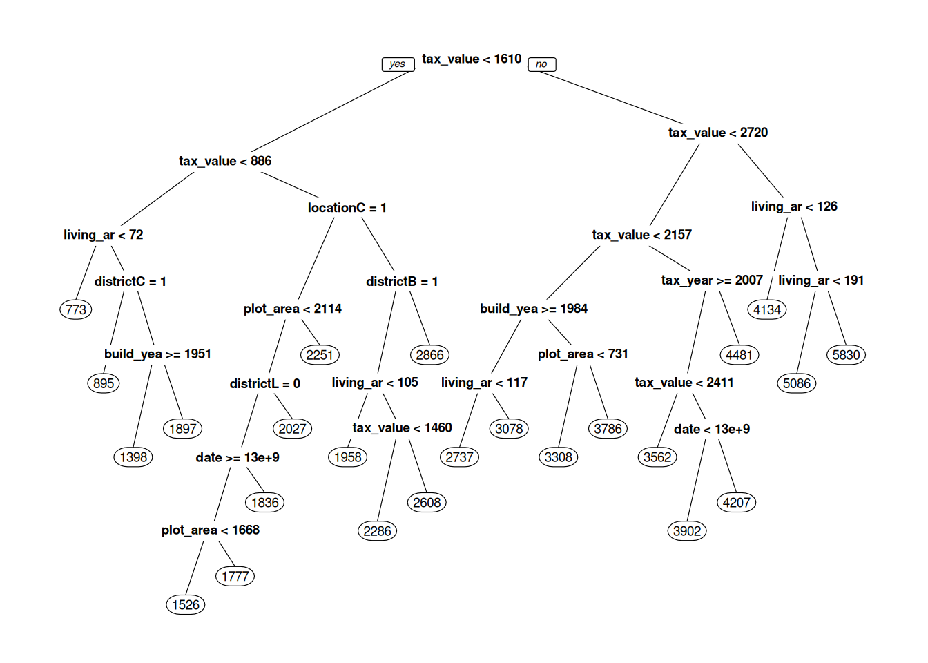
Figure 11.1: Decision tree for predicting real estate prices.
What we see in Figure 11.1 is our machine learning model – our decision tree. When it is used for prediction, the new observation is fed to the top of the tree, where a question about the new observation is asked: “is tax_value < 1610”? If the answer is yes, the observation continues down the line to the left, to the next question. If the answer is no, it continues down the line to the right, to the question “is tax_value < 2720”, and so on. After a number of questions, the observation reaches a circle – a so-called leaf node, with a number in it. This number is the predicted selling price of the house, which is based on observations in the training data that belong to the same leaf. When the tree is used for classification, the predicted probability of class A is the proportion of observations from the training data in the leaf that belong to class A.
prp has a number of parameters that lets us control what our tree plot looks like. box.palette, shadow.col, nn, type, extra, and cex are all useful – read the documentation for prp to see how they affect the plot:
prp(m$finalModel,
box.palette = "RdBu",
shadow.col = "gray",
nn = TRUE,
type = 3,
extra = 1,
cex = 0.75)When fitting the model, rpart builds the tree from the top down. At each split, it tries to find a question that will separate subgroups in the data as much as possible. There is no need to standardise the data (in fact, this won’t change the shape of the tree at all).
\[\sim\]
Exercise 11.14 Fit a classification tree model to the wine data, using pH, alcohol, fixed.acidity, and residual.sugar as explanatory variables. Evaluate its \(AUC\) using repeated 10-fold cross-validation.
Plot the resulting decision tree. It is too large to be easily understandable and needs to be pruned. This is done using the parameter
cp. Try increasing the value ofcpintuneGrid = expand.grid(cp = 0)to different values between 0 and 1. What happens with the tree?Use
tuneGrid = expand.grid(cp = seq(0, 0.01, 0.001))to find an optimal choice ofcp. What is the result?
(Click here to go to the solution.)
Exercise 11.15 Fit a regression tree model to the bacteria.csv data to see how OD changes with Time, using the data from observations 45 to 90 of the data frame, as in the example in Section 11.3.3. Then make predictions for all observations in the dataset. Plot the actual OD values along with your predictions. Does the model extrapolate well?
(Click here to go to the solution.)
11.5.2 Random forests
Random forest (Breiman, 2001) is an ensemble method, which means that it is based on combining multiple predictive models. In this case, it is a combination of multiple decision trees that have been built using different subsets of the data. Each tree is fitted to a bootstrap sample of the data (a procedure known as bagging), and at each split only a random subset of the explanatory variables are used. The predictions from these trees are then averaged to obtain a single prediction. While the individual trees in the forest tend to have rather poor performance, the random forest itself often performs better than a single decision tree fitted to all of the data using all variables.
To fit a random forest to the estates data (loaded in the same way as in Section 11.5.1), we set method = "rf", which will let us do the fitting using functions from the randomForest package. The random forest has a parameter called mtry that determines the number of randomly selected explanatory variables. As a rule-of-thumb, mtry close to \(\sqrt{p}\), where \(p\) is the number of explanatory variables in your data, is usually a good choice. When trying to find the best choice for mtry I recommend trying some values close to that.
For the estates data we have 11 explanatory variables, and so a value of mtry close to \(\sqrt{11}\approx 3\) could be a good choice. Let’s try a few different values with a 10-fold cross-validation:
library(caret)
tc <- trainControl(method = "cv",
number = 10)
m <- train(selling_price ~ .,
data = estates,
trControl = tc,
method = "rf",
tuneGrid = expand.grid(mtry = 2:4))
mIn my run, an mtry equal to 4 gave the best results. Let’s try larger values as well, just to see if that gives a better model:
m <- train(selling_price ~ .,
data = estates,
trControl = tc,
method = "rf",
tuneGrid = expand.grid(mtry = 4:10))
mWe can visually inspect the impact of mtry by plotting m:
For this data, a value of mtry that is a little larger than what usually is recommended seems to give the best results. It was a good thing that we didn’t just blindly go with the rule-of-thumb but instead tried a few different values.
Random forests have a built-in variable importance measure, which is based on measuring how much worse the model fares when the values of each variable are permuted. This is a much more sensible measure of variable importance than that presented in Section 11.3.2. The importance values are reported on a relative scale, with the value for the most important variable always being 100. Let’s have a look:
\[\sim\]
Exercise 11.17 Fit a decision tree model and a random forest to the wine data, using all variables (except type) as explanatory variables. Evaluate their performance using 10-fold cross-validation. Which model has the best performance?
(Click here to go to the solution.)
Exercise 11.18 Fit a random forest to the bacteria.csv data to see how OD changes with Time, using the data from observations 45 to 90 of the data frame, as in the example in Section 11.3.3. Then make predictions for all observations in the dataset. Plot the actual OD values along with your predictions. Does the model extrapolate well?
(Click here to go to the solution.)
11.5.3 Boosted trees
Another useful class of ensemble method that relies on combining decision trees is boosted trees. Several different versions are available; we’ll use a version called Stochastic Gradient Boosting (Friedman, 2002), which is available through the gbm package. Let’s start by installing that:
The decision trees in the ensemble are built sequentially, with each new tree giving more weight to observations for which the previous trees performed poorly. This process is known as boosting.
When fitting a boosted trees model in caret, we set method = "gbm". There are four parameters that we can use to find a better fit. The two most important are interaction.depth, which determines the maximum tree depth (values greater than \(\sqrt{p}\), where \(p\) is the number of explanatory variables in your data, are discouraged) and n.trees, which specifies the number of trees to fit (also known as the number of boosting iterations). Both can have a large impact on the model fit. Let’s try a few values with the estates data (loaded in the same way as in Section 11.5.1):
library(caret)
tc <- trainControl(method = "cv",
number = 10)
m <- train(selling_price ~ .,
data = estates,
trControl = tc,
method = "gbm",
tuneGrid = expand.grid(
interaction.depth = 1:3,
n.trees = seq(20, 200, 10),
shrinkage = 0.1,
n.minobsinnode = 10),
verbose = FALSE)
mThe setting verbose = FALSE is used to stop gbm from printing details about each fitted tree.
We can plot the model performance for different settings:
As you can see, using more trees (a higher number of boosting iterations) seems to lead to a better model. However, if we use too many trees, the model usually overfits, leading to a worse performance in the evaluation:
m <- train(selling_price ~ .,
data = estates,
trControl = tc,
method = "gbm",
tuneGrid = expand.grid(
interaction.depth = 1:3,
n.trees = seq(25, 500, 25),
shrinkage = 0.1,
n.minobsinnode = 10),
verbose = FALSE)
ggplot(m)A table and plot of variable importance is given by summary:
In many problems, boosted trees are among the best-performing models. They do, however, require a lot of tuning, which can be time-consuming, both in terms of how long it takes to run the tuning and in terms of how much time you have to spend fiddling with the different parameters. Several different implementations of boosted trees are available in caret. A good alternative to gbm is xgbTree from the xgboost package. I’ve chosen not to use that for the examples here, as it often is slower to train due to having a larger number of hyperparameters (which in return makes it even more flexible!).
\[\sim\]
Exercise 11.20 Fit a boosted trees model to the wine data, using all variables (except type) as explanatory variables. Evaluate its performance using repeated 10-fold cross-validation. What is the best \(AUC\) that you can get by tuning the model parameters?
(Click here to go to the solution.)
Exercise 11.21 Fit a boosted trees regression model to the bacteria.csv data to see how OD changes with Time, using the data from observations 45 to 90 of the data frame, as in the example in Section 11.3.3. Then make predictions for all observations in the dataset. Plot the actual OD values along with your predictions. Does the model extrapolate well?
(Click here to go to the solution.)
11.5.4 Model trees
A downside to all the tree-based models that we’ve seen so far is their inability to extrapolate when the explanatory variables of a new observation are outside the range in the training data. You’ve seen this, e.g., in Exercise 11.15. Methods based on model trees solve this problem by fitting, e.g., a linear model in each leaf node of the decision tree. Ordinary decision trees fit regression models that are piecewise constant, while model trees utilising linear regression fit regression models that are piecewise linear.
The model trees that we’ll now have a look at aren’t available in caret, meaning that we can’t use its functions for evaluating models using cross-validations. We can, however, still perform cross-validation using a for loop, as we did in the beginning of Section 11.1.3. Model trees are available through the partykit package, which we’ll install next. We’ll also install ggparty, which contains tools for creating good-looking plots of model trees:
The model trees in partykit differ from classical decision trees not only in how the nodes are treated, but also in how the splits are determined; see Zeileis et al. (2008) for details. To illustrate their use, we’ll return to the estates data. The model formula for model trees has two parts. The first specifies the response variable and what variables to use for the linear models in the nodes, and the second part specifies what variables to use for the splits. In our example, we’ll use living_area as the sole explanatory variable in our linear models, and location, build_year, tax_value, and plot_area for the splits (in this particular example, there is no overlap between the variables used for the linear models and the variables used for the splits, but it is perfectly fine to have an overlap if you like!).
As in Section 11.5.1, we set file_path to the path to estates.xlsx and import and clean the data. We can then fit a model tree with linear regressions in the nodes using lmtree:
library(openxlsx)
estates <- read.xlsx(file_path)
estates <- na.omit(estates)
# Make location a factor variable:
estates$location <- factor(estates$location)
# Fit model tree:
library(partykit)
m <- lmtree(selling_price ~ living_area | location + build_year +
tax_value + plot_area,
data = estates)Next, we plot the resulting tree – make sure that you enlarge your Plot panel so that you can see the linear models fitted in each node:
By adding additional arguments to lmtree, we can control, e.g., the amount of pruning. You can find a list of all the available arguments by having a look at ?mob_control. To do automated likelihood-based pruning, we can use prune = "AIC" or prune = "BIC", which yields a slightly shorter tree:
m <- lmtree(selling_price ~ living_area | location + build_year +
                                           tax_value + plot_area,
            data = estates,
            prune = "BIC")

autoplot(m)
As per usual, we can use predict to make predictions from our model. Similar to how we used lmtree above, we can use glmtree to fit a logistic regression in each node, which can be useful for classification problems. We can also fit Poisson regressions in the nodes using glmtree, creating more flexible Poisson regression models. For more information on how you can control how model trees are plotted using ggparty, have a look at vignette("ggparty-graphic-partying").
\[\sim\]
Exercise 11.23 In this exercise, you will fit model trees to the bacteria.csv data to see how OD changes with Time.
Fit a model tree and a decision tree, using the data from observations 45 to 90 of the data frame, as in the example in Section 11.3.3. Then make predictions for all observations in the dataset. Plot the actual OD values along with your predictions. Do the models extrapolate well?
Now, fit a model tree and a decision tree using the data from observations 20 to 120 of the data frame. Then make predictions for all observations in the dataset. Does this improve the models’ ability to extrapolate?
11.5.5 Discriminant analysis
In linear discriminant analysis (LDA), prior knowledge about how common different classes are is used to classify new observations using Bayes’ theorem. It relies on the assumption that the data from each class is generated by a multivariate normal distribution, and that all classes share a common covariance matrix. The resulting decision boundary is a hyperplane.
As part of fitting the model, LDA creates linear combinations of the explanatory variables, which are used for separating different classes. These can be used both for classification and as a supervised alternative to principal components analysis (PCA, Section 4.11).
LDA does not require any tuning. It does, however, allow you to specify prior class probabilities if you like, using the prior argument, allowing for Bayesian classification. If you don’t provide a prior, the class proportions in the training data will be used instead. Here is an example using the wine data from Section 11.1.7:
library(caret)
tc <- trainControl(method = "repeatedcv",
                   number = 10, repeats = 100,
                   summaryFunction = twoClassSummary,
                   savePredictions = TRUE,
                   classProbs = TRUE)

# Without the use of a prior:
# Prior probability of a red wine is 0.25 (i.e., the
# proportion of red wines in the dataset).
m_no_prior <- train(type ~  pH + alcohol + fixed.acidity +
                      residual.sugar,
           data = wine,
           trControl = tc,
           method = "lda",
           metric = "ROC")

# With a prior:
# Prior probability of a red wine is set to be 0.5.
m_with_prior <- train(type ~  pH + alcohol + fixed.acidity +
                        residual.sugar,
           data = wine,
           trControl = tc,
           method = "lda",
           metric = "ROC",
           prior = c(0.5, 0.5))

m_no_prior
m_with_prior
As I mentioned, LDA can also be used as an alternative to PCA, which we studied in Section 4.11. Let’s have a look at the seeds data that we used in that section:
# The data is downloaded from the UCI Machine Learning Repository:
# http://archive.ics.uci.edu/ml/datasets/seeds
seeds <- read.table("https://tinyurl.com/seedsdata",
        col.names = c("Area", "Perimeter", "Compactness",
         "Kernel_length", "Kernel_width", "Asymmetry",
         "Groove_length", "Variety"))
seeds$Variety <- factor(seeds$Variety)
When caret fits an LDA, it uses the lda function from the MASS package, which uses the same syntax as lm. If we use lda directly, without involving caret, we can extract the scores (linear combinations of variables) for all observations. We can then plot these, to get something similar to a plot of the first two principal components. There is a difference though – PCA seeks to create new variables that summarise as much as possible of the variance in the data, whereas LDA seeks to create new variables that can be used to discriminate between pre-specified groups.
# Run an LDA:
library(MASS)
m <- lda(Variety ~ ., data = seeds)

# Save the LDA scores:
lda_preds <- data.frame(Type = seeds$Variety,
                        Score = predict(m)$x)
View(lda_preds)
# There are 3 varieties of seeds. LDA creates 1 less new variable
# than the number of categories - so 2 in this case. We can
# therefore visualise these using a simple scatterplot.

# Plot the two LDA scores for each observation to get a visual
# representation of the data:
library(ggplot2)
ggplot(lda_preds, aes(Score.LD1, Score.LD2, colour = Type)) +
      geom_point()
\[\sim\]
Exercise 11.24 An alternative to linear discriminant analysis is quadratic discriminant analysis (QDA). This is closely related to LDA, the difference being that we no longer assume that the classes have equal covariance matrices. The resulting decision boundaries are quadratic (i.e., non-linear). Run a QDA on the wine data, by using method = "qda" in train.
(Click here to go to the solution.)
Exercise 11.25 Fit an LDA classifier and a QDA classifier to the seeds data from Section 4.11, using Variety as the response variable and Kernel_length and Compactness as explanatory variables. Plot the resulting decision boundaries, as in Section 11.1.8. Do they seem reasonable to you?
(Click here to go to the solution.)
Exercise 11.26 An even more flexible version of discriminant analysis is mixture discriminant analysis (MDA), which uses normal mixture distributions for classification. That way, we no longer have to rely on the assumption of normality. It is available through the mda package and can be used in train with method = "mda". Fit an MDA classifier to the seeds data from Section 4.11, using Variety as the response variable and Kernel_length and Compactness as explanatory variables. Plot the resulting decision boundaries, as in Section 11.1.8. Do they seem reasonable to you?
11.5.6 Support vector machines
Support vector machines (SVM), is a flexible class of methods for classification and regression. Like LDA, they rely on hyperplanes to separate classes. Unlike LDA, however, more weight is put to points close to the border between classes. Moreover, the data is projected into a higher-dimensional space, with the intention of creating a projection that yields a good separation between classes. Several different projection methods can be used, typically represented by kernels – functions that measure the inner product in these high-dimensional spaces.
Despite the fancy mathematics, using SVMs is not that difficult. With caret, we can fit SVMs with many different types of kernels using the kernlab package. Let’s install it:
The simplest SVM uses a linear kernel, creating a linear classification that is reminiscent of LDA. Let’s look at an example using the wine data from Section 11.1.7. The parameter \(C\) is a regularisation parameter:
library(caret)
tc <- trainControl(method = "cv",
                   number = 10,
                   summaryFunction = twoClassSummary,
                   savePredictions = TRUE,
                   classProbs = TRUE)

m <- train(type ~  pH + alcohol + fixed.acidity + residual.sugar,
           data = wine,
           trControl = tc,
           method = "svmLinear",
           tuneGrid = expand.grid(C = c(0.5, 1, 2)),
           metric = "ROC")
There are a number of other non-linear kernels that can be used, with different hyperparameters that can be tuned. Without going into details about the different kernels, some important examples are:
method = "svmPoly": polynomial kernel. The tuning parameters aredegree(the polynomial degree, e.g., 3 for a cubic polynomial),scale(scale) andC(regularisation).method = "svmRadialCost": radial basis/Gaussian kernel. The only tuning parameter isC(regularisation).method = "svmRadialSigma": radial basis/Gaussian kernel with tuning of \(\sigma\). The tuning parameters areC(regularisation) andsigma(\(\sigma\)).method = "svmSpectrumString": spectrum string kernel. The tuning parameters areC(regularisation) andlength(length).
\[\sim\]
Exercise 11.27 Fit an SVM to the wine data, using all variables (except type) as explanatory variables, using a kernel of your choice. Evaluate its performance using repeated 10-fold cross-validation. What is the best \(AUC\) that you can get by tuning the model parameters?
(Click here to go to the solution.)
Exercise 11.28 In this exercise, you will fit SVM regression models to the bacteria.csv data to see how OD changes with Time.
Fit an SVM, using the data from observations 45 to 90 of the data frame, as in the example in Section 11.3.3. Then make predictions for all observations in the dataset. Plot the actual OD values along with your predictions. Does the model extrapolate well?
Now, fit an SVM using the data from observations 20 to 120 of the data frame. Then make predictions for all observations in the dataset. Does this improve the model’s ability to extrapolate?
(Click here to go to the solution.)
11.5.7 Nearest neighbours classifiers
In classification problems with numeric explanatory variables, a natural approach to finding the class of a new observation is to look at the classes of neighbouring observations, i.e., of observations that are “close” to it in some sense. This requires a distance measure, to measure how close observations are. A kNN classifier classifies the new observations by letting the \(k\) Nearest Neighbours – the \(k\) points that are the closest to the observation – “vote” about the class of the new observation. As an example, if \(k=3\), two of the three closest neighbours belong to class A, and one of the three closest neighbours belongs to class B, then the new observation will be classified as A. If we like, we can also use the proportion of different classes among the nearest neighbours to get predicted probabilities of the classes (in our example: 2/3 for A, 1/3 for B).
What makes kNN appealing is that it doesn’t require a complicated model; instead, we simply compare observations to each other. A major downside is that we have to compute the distance between each new observation and all observations in the training data, which can be time-consuming if you have large datasets. Moreover, we consequently have to store the training data indefinitely, as it is used each time we use the model for prediction. This can cause problems, e.g., if the data are of a kind that falls under the European General Data Protection Regulation (GDPR), which limits how long data can be stored, and for what purpose.
A common choice of distance measure, which is the default when we set method = "knn" in train, is the common Euclidean distance. We need to take care to standardise our variables before using it, as variables with a high variance otherwise automatically will contribute more to the Euclidean distance. Unlike in regularised regression, caret does not do this for us. Instead, we must provide the argument preProcess = c("center", "scale") to train.
An important choice in kNN is what value to use for the parameter \(k\). If \(k\) is too small, we use too little information, and if \(k\) is too large, the classifier will become prone to classify all observations as belonging to the most common class in the training data. \(k\) is usually chosen using cross-validation or bootstrapping. To have caret find a good choice of \(k\) for us (as we did with \(\lambda\) in regularised regression models), we use the argument tuneLength in train, e.g., tuneLength = 15 to try 15 different values of \(k\).
By now, I think you’ve seen enough examples of how to fit models in caret that you can figure out how to fit a model with knn on your own (using the information above, of course). In the next exercise, you will give kNN a go, using the wine data.
\[\sim\]
Exercise 11.30 Fit a kNN classification model to the wine data, using pH, alcohol, fixed.acidity, and residual.sugar as explanatory variables. Evaluate its performance using 10-fold cross-validation, using \(AUC\) to choose the best \(k\). Is it better than the logistic regression models that you fitted in Exercise 11.5?
(Click here to go to the solution.)
11.6 Forecasting time series
A time series, as those we studied in Section 4.7, is a series of observations sorted in time order. The goal of time series analysis is to model temporal patterns in data. This allows us to take correlations between observations into account (today’s stock prices are correlated to yesterday’s), to capture seasonal patterns (ice cream sales always increase during the summer), and to incorporate those into predictions, or forecasts, for the future. This section acts as a brief introduction to how this can be done.
11.6.1 Decomposition
In Section 4.7.5 we saw how time series can be decomposed into three components:
- Seasonal component, describing recurring seasonal patterns,
- Trend component, describing a trend over time,
- Remainder component, describing random variation.
Let’s have a quick look at how to do this in R, using the a10 data from fpp2:
The stl function uses repeated LOESS smoothing to decompose the series. The s.window parameter lets us set the length of the season in the data. We can set it to "periodic" to have stl find the periodicity of the data automatically:
We can access the different parts of the decomposition as follows:
a10_stl <- stl(a10, s.window = "periodic")
a10_stl$time.series[,"seasonal"]
a10_stl$time.series[,"trend"]
a10_stl$time.series[,"remainder"]
When modelling time series data, we usually want to remove the seasonal component, as it makes the data structure too complicated. We can then add it back when we use the model for forecasting. We’ll see how to do that in the following sections.
11.6.2 Forecasting using ARIMA models
The forecast package contains a large number of useful methods for fitting time series models. Among them is auto.arima which can be used to fit autoregressive integrated moving average (ARIMA) models to time series data. ARIMA models are a flexible class of models that can capture many different types of temporal correlations and patterns. auto.arima helps us select a model that seems appropriate based on historical data, using an in-sample criterion, a version of \(AIC\), for model selection.
stlm can be used to fit a model after removing the seasonal component, and then automatically add it back again when using it for a forecast. The modelfunction argument lets us specify what model to fit. Let’s use auto.arima for model fitting through stlm:
library(forecast)
library(fpp2)

# Fit the model after removing the seasonal component:
tsmod <- stlm(a10, s.window = "periodic", modelfunction = auto.arima)
For model diagnostics, we can use checkresiduals to check whether the residuals from the model look like white noise (i.e., look normal):
In this case, the variance of the series seems to increase with time, which the model fails to capture. We therefore see more large residuals than what is expected under the model.
Nevertheless, let’s see how we can make a forecast for the next 24 months. The function for this is the aptly named forecast:
# Plot the forecast (with the seasonal component added back)
# for the next 24 months:
forecast(tsmod, h = 24)

# Plot the forecast along with the original data:
autoplot(forecast(tsmod, h = 24))
In addition to the forecasted curve, forecast also provides prediction intervals. By default, these are based on an asymptotic approximation. To obtain bootstrap prediction intervals instead, we can add bootstrap = TRUE to forecast:
The forecast package is designed to work well with pipes. To fit a model using stlm and auto.arima and then plot the forecast, we could have used:
a10 |> stlm(s.window = "periodic", modelfunction = auto.arima) |>
        forecast(h = 24, bootstrap = TRUE) |> autoplot()
It is also possible to incorporate seasonal effects into ARIMA models by adding seasonal terms to the model. auto.arima will do this for us if we apply it directly to the data:
For this data, the forecasts from the two approaches are very similar.
In Section 11.3 we mentioned that a common reason for predictive models failing in practical applications is that many processes are non-stationary, meaning that their patterns change over time. ARIMA model are designed to handle some types of non-stationarity, which can make them particularly useful for modelling such processes.
\[\sim\]
Exercise 11.32 Return to the writing dataset from the fma package that we studied in Exercise 4.15. Remove the seasonal component. Fit an ARIMA model to the data and use it to plot a forecast for the next three years, with the seasonal component added back and with bootstrap prediction intervals.
11.7 Deploying models
The process of making a prediction model available to other users or systems, for instance by running them on a server, is known as deployment. In addition to the need for continuous model evaluation, mentioned in Section 11.3.6, you will also need to check that your R code works as intended in the environment you deploy your model. For instance, if you developed your model using R 4.1 and then run it on a server running R 3.6 with out-of-date versions of the packages you used, there is a risk that some of the functions that you use behave differently from what you expected. Maybe something that should be a factor variable becomes a character variable, which breaks that part of your code where you use levels. A lot of the time, small changes are enough to make the code work in the new environment (add a line that converts the variable to a factor), but sometimes large changes can be needed. Likewise, you must check that the model still works after the software is updated on the server.
11.7.1 Creating APIs with plumber
An Application Programming Interface (API) is an interface that lets other systems access your R code – which is exactly what you want when you’re ready to deploy your model. By using the plumber package to create an API (or a REST API, to be more specific), you can let other systems (web page, Java script, Python script, and so on) access your model. Those systems can call your model, sending some input, and then receive its output in different formats, e.g., a JSON list, a csv file, or an image.
We’ll illustrate how this works with a simple example. First, let’s install plumber:
Next, assume that we’ve fitted a model (we’ll use the linear regression model for mtcars that we’ve used several times before). We can use this model to make predictions:
We would like to make these predictions available to other systems. That is, we’d like to allow other systems to send values of hp and wt to our model and get predictions in return. To do so, we start by writing a function for the predictions:
m <- lm(mpg ~ hp + wt, data = mtcars)

predictions <- function(hp, wt)
{
    predict(m, newdata = data.frame(hp = hp, wt = wt))
}

predictions(150, 2)
To make this accessible to other systems, we save this function in a script called mtcarsAPI.R (make sure to save it in your working directory), which looks as follows:
# Fit the model:
m <- lm(mpg ~ hp + wt, data = mtcars)

#* Return the prediction:
#* @param hp
#* @param wt
#* @post /predictions
function(hp, wt)
{
    predict(m, newdata = data.frame(hp = as.numeric(hp),
                                    wt = as.numeric(wt)))
}
The only changes that we have made are some additional special comments (#*), which specify what input is expected (parameters hp and wt) and that the function is called predictions. plumber uses this information to create the API. The functions made available in an API are referred to as endpoints.
To make the function available to other systems, we run pr as follows:
The function will now be available on port 8000 of your computer. To access it, you can open your browser and go to the following URL:
http://localhost:8000/predictions?hp=150&wt=2
Try changing the values of hp and wt and see how the returned value changes.
That’s it! As long as you leave your R session running with plumber, other systems will be able to access the model using the URL. Typically, you would run this on a server and not on your personal computer.
11.7.2 Different types of output
You won’t always want to return a number. Maybe you want to use R to create a plot, send a file, or print some text. Here is an example of an R script, which we’ll save as exampleAPI.R, that returns different types of output – an image, a text, and a downloadable csv file:
#* Plot some random numbers
#* param n The number of points to plot
#* @serializer png
#* @get /plot
function(n = 15) {
  x <- rnorm(as.numeric(n))
  y <- rnorm(as.numeric(n))
  plot(x, y, col = 2, pch = 16)
}

#* Print a message
#* @param name Your name
#* @get /message
function(name = "") {
  list(message = paste("Hello", name, "- I'm happy to see you!"))
}

#* Download the mtcars data as a csv file
#* @serializer csv
#* @get /download
function() {
  mtcars
}
After you’ve saved the file in your working directory, run the following to create the API:
You can now try the different endpoints:
http://localhost:8000/plothttp://localhost:8000/plot?n=50http://localhost:8000/message?name=Oskarhttp://localhost:8000/download
We’ve only scratched the surface of plumber’s capabilities here. A more thorough guide can be found on the official plumber web page at: https://www.rplumber.io/
Many, but not all, classifiers also output predicted class probabilities. The distinction between regression models and classifiers is blurry at best.↩︎
If your CPU has three or fewer cores, you should lower this number.↩︎
Parameters like \(\lambda\) that describe “settings” used for the method rather than parts of the model are often referred to as hyperparameters.↩︎
The name
rpartmay seem cryptic: it is an abbreviation for Recursive Partitioning and Regression Trees, which is a type of decision trees.↩︎