2 The basics
Let’s start from the very beginning. This chapter acts as an introduction to R. It will show you how to install and work with R and RStudio.
After working with the material in this chapter, you will be able to:
- Create reusable R scripts,
- Store data in R,
- Use functions in R to analyse data,
- Install add-on packages adding more features to R,
- Compute descriptive statistics like the mean and the median, including for subgroups,
- Do mathematical calculations,
- Create nice-looking plots, including scatterplots, boxplots, histograms and bar charts,
- Distinguish between different data types,
- Import data from Excel spreadsheets and csv text files,
- Add new variables to your data,
- Modify variables in your data,
- Remove variables from your data,
- Save and export your data,
- Work with RStudio projects,
- Use
|>pipes to chain functions together, and - Find errors in your code.
2.1 Installing R and RStudio
To download R, go to the R Project website:
https://cran.r-project.org/mirrors.html
Choose a download mirror, i.e., a server to download the software from. I recommend choosing a mirror close to you. You can then choose to download R for either Linux1, Mac or Windows by following the corresponding links (Figure 2.1).
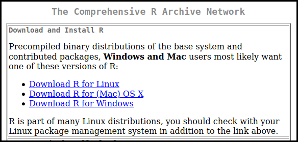
Figure 2.1: Screenshot from the R download page at https://ftp.acc.umu.se/mirror/CRAN/
The version of R that you should download is called the (base) binary. Download and run it to install R. You may see mentions of 64-bit and 32-bit versions of R; if you have a modern computer (which in this case means a computer from 2010 or later), you should go with the 64-bit version.
You have now installed the R programming language. Working with it is easier with an integrated development environment (IDE) which allows you to easily write, run and debug your code. This book is written for use with the RStudio IDE, but 99.9% of it will work equally well with other IDEs, like Emacs with ESS or Jupyter notebooks.
To download RStudio, go to the RStudio download page:
https://rstudio.com/products/rstudio/download/#download
Click on the link to download the installer for your operating system, and then run it.
2.2 A first look at RStudio
When you launch RStudio, you will see three or four panes, as seen in Figure 2.2.
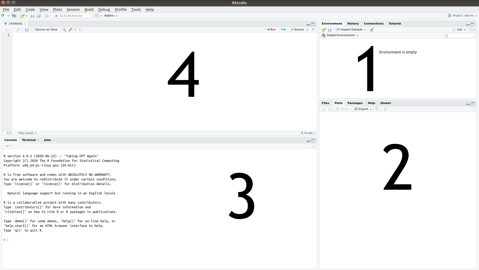
Figure 2.2: The four RStudio panes.
- The Environment pane, where a list of the data you have imported and created can be found.
- The Files, Plots and Help pane, where you can see a list of available files, will be able to view graphs that you produce, and can find help documents for different parts of R.
- The Console pane, used for running code. This is where we’ll start with the first few examples.
- The Script pane, used for writing code. This is where you’ll spend most of your time working.
If you launch RStudio by opening a file with R code, the Script pane will appear; otherwise, it won’t. Don’t worry if you don’t see it at this point; you’ll learn how to open it soon enough.
The Console pane will contain R’s startup message, which shows information about which version of R you’re running2:
R version 4.4.0 (2024-04-24) -- "Puppy Cup"
Copyright (C) 2024 The R Foundation for Statistical Computing
Platform: aarch64-apple-darwin20 (64-bit)

R is free software and comes with ABSOLUTELY NO WARRANTY.
You are welcome to redistribute it under certain conditions.
Type 'license()' or 'licence()' for distribution details.

  Natural language support but running in an English locale

R is a collaborative project with many contributors.
Type 'contributors()' for more information and
'citation()' on how to cite R or R packages in publications.

Type 'demo()' for some demos, 'help()' for on-line help, or
'help.start()' for an HTML browser interface to help.
Type 'q()' to quit R.
You can resize the panes as you like, either by clicking and dragging their borders or using the minimise/maximise buttons in the upper right corner of each pane.
When you exit RStudio, you will be asked if you wish to save your workspace, meaning that the data that you’ve worked with will be stored so that it is available the next time you run R. That might sound like a good idea, but in general, I recommend that you don’t save your workspace, as that often turns out to cause problems down the line. It is almost invariably a much better idea to simply rerun the code you worked with in your next R session.
2.3 Running R code
Everything that we do in R revolves around code. The code will contain instructions for how the computer should treat, analyse and manipulate3 data. Thus each line of code tells R to do something: compute a mean value, create a plot, sort a dataset, or something else.
Throughout the text, there will be code chunks that you can paste into the Console pane. Here is the first example of such a code chunk. Type or copy the code into the Console and press Enter on your keyboard:
Code chunks will frequently contain multiple lines. You can select and copy both lines from the digital version of this book and simultaneously paste them directly into the Console:
As you can see, when you type the code into the Console pane and press Enter, R runs (or executes) the code and returns an answer. To get you started, the first exercise will have you write a line of code to perform a computation. You can find a solution to this and other exercises at the book’s webpage: http://www.modernstatisticswithr.com.
\[\sim\]
Exercise 2.1 Use R to compute the product of the first 10 integers: \(1\cdot 2\cdot 3\cdot 4\cdot 5\cdot 6\cdot 7\cdot 8\cdot 9\cdot 10\).
(Click here to go to the solution.)
2.3.1 R scripts
When working in the Console pane (i.e., when the Console pane is active and you see a blinking text cursor in it), you can use the up arrow ↑ on your keyboard to retrieve lines of code that you’ve previously used. There is however a much better way of working with R code: to put it in script files. These are files containing R code that you can save and then run again whenever you like.
To create a new script file in RStudio, press Ctrl+Shift+N on your keyboard, or select File > New File > R Script in the menu. This will open a new Script pane (or a new tab in the Script pane, in case it was already open). You can then start writing your code in the Script pane. For instance, try the following:
In the Script pane, when you press Enter, you insert a new line instead of running the code. That’s because the Script pane is used for writing code rather than running it. To actually run the code, you must send it to the Console pane. This can be done in several ways. Let’s give them a try to see which you prefer.
To run the entire script, do one of the following:
- Press the Source button in the upper right corner of the Script pane.
- Press Ctrl+Shift+Enter on your keyboard.
- Press Ctrl+Alt+Enter on your keyboard to run the code without printing the code and its output in the Console.
To run a part of the script, first select the lines you wish to run, e.g., by highlighting them using your mouse. Then do one of the following:
- Press the Run button in the upper right corner of the Script pane.
- Press Ctrl+Enter on your keyboard (this is how I usually do it).
To save your script, click the Save icon, choose File > Save in the menu or press Ctrl+S. R script files should have the file extension .R, e.g. My first R script.R. Remember to save your work often, and to save your code for all the examples and exercises in this book. You will likely want to revisit old examples in the future to see how something was done.
2.4 Variables and functions
Of course, R is so much more than just a fancy calculator. To unlock its full potential, we need to discuss two key concepts: variables (used for storing data) and functions (used for doing things with the data).
2.4.1 Storing data
Without data, there is no data analytics. So how can we store and read data in R? The answer is that we use variables. A variable is a name used to store data, so that we can refer to a dataset when we write code. As the name variable implies, what is stored can change over time4.
The code
is used to assign the value 4 to the variable x. It is read as “assign 4 to x”. The <- part is made by writing a less than sign (<) and a hyphen (-) with no space between them5.
If we now type x in the Console, R will return the answer 4. Well, almost. In fact, R returns the following rather cryptic output:
[1] 4The meaning of the 4 is clear – it’s a 4. We’ll return to what the [1] part means soon.
Now that we’ve created a variable, called x, and assigned a value (4) to it, x will have the value 4 whenever we use it again. This works just like a mathematical formula, where we for instance can insert the value \(x=4\) into the formula \(x+1\). The following two lines of code will compute \(x+1=4+1=5\) and \(x+x=4+4=8\):
Once we have assigned a value to x, it will appear in the Environment pane in RStudio, where you can see both the variable’s name and its value.
The left-hand side of the assignment x <- 4 is always the name of a variable, but the right-hand side can be any piece of code that creates some sort of object to be stored in the variable. For instance, we could perform a computation on the right-hand side and then store the result in the variable:
R first evaluates the entire right-hand side, which in this case amounts to computing 1+2+3+4, and then assigns the result (10) to x. Note that the value previously assigned to x (i.e., 4) now has been replaced by 10. After a piece of code has been run, the values of the variables affected by it will have changed. There is no way to revert the run and get that 4 back, save to rerun the code that generated it in the first place.
You’ll notice that in the code above, I’ve added some spaces, for instance between the numbers and the plus signs. This is simply to improve readability. The code works just as well without spaces:
or with spaces in some places, but not in others:
However, you cannot place a space in the middle of the <- arrow. The following will not assign a value to x:
Running that piece of code rendered the output FALSE. This is because < - with a space has a different meaning than <- in R, one that we shall return to later in this chapter.
In some cases, you may want to switch the direction of the arrow, so that the variable name is on the right-hand side. This is called right-assignment and works just fine too:
Later on, we’ll see plenty of examples where right-assignment comes in handy.
\[\sim\]
Exercise 2.2 Do the following using R:
Compute the sum \(924+124\) and assign the result to a variable named
a.Compute \(a\cdot a\).
2.4.2 What’s in a name?
You now know how to assign values to variables. But what should you call your variables? Of course, you can follow the examples in the previous section and give your variables names like x, y, a and b. However, you don’t have to use single-letter names, and for the sake of readability, it is often preferable to give your variables more informative names. Compare the following two code chunks:
and
Both chunks will run without any errors and yield the same results, and yet there is a huge difference between them. The first chunk is opaque – in no way does the code help us conceive what it actually does. On the other hand, it is perfectly clear that the second chunk is used to compute a net income by subtracting taxes from income. You don’t want to be a chunk-one type R user, who produces impenetrable code with no clear purpose. You want to be a chunk-two type R user, who writes clear and readable code where the intent of each line is clear. Take it from me; for years I was a chunk-one guy. I managed to write a lot of useful code, but whenever I had to return to my old code to reuse it or fix some bug, I had difficulties understanding what each line was supposed to do. My new life as a chunk-two guy is better in every way.
So, what’s in a name? Shakespeare’s balcony-bound Juliet would have us believe that that which we call a rose by any other name would smell as sweet. Translated to R practice, this means that your code will run just fine no matter what names you choose for your variables. But when you or somebody else reads your code, it will help greatly if you call a rose, a rose and not x or my_new_variable_5.
You should note that R is case-sensitive, meaning that my_variable, MY_VARIABLE, My_Variable, and mY_VariABle are treated as different variables. To access the data stored in a variable, you must use its exact name – including lower- and uppercase letters in the right places. Writing the wrong variable name is one of the most common errors in R programming.
You’ll frequently find yourself wanting to compose variable names out of multiple words, as we did with net_income. However, R does not allow spaces in variable names, and so net income would not be a valid variable name. There are a few different naming conventions that can be used to name your variables:
snake_case, where words are separated by an underscore (_). Example:household_net_income.camelCaseorCamelCase, where each new word starts with a capital letter. Example:householdNetIncomeorHouseholdNetIncome.period.case, where each word is separated by a period (.). You’ll find this used a lot in R, but I’d advise that you don’t use it for naming variables, as a period in the middle of a name can have a different meaning in more advanced cases6. Example:household.net.income.concatenatedwordscase, where the words are concatenated using only lowercase letters. Adownsidetothisconventionisthatitcanmakevariablenamesverydifficultoreadsousethisatyourownrisk. Example:householdnetincomeSCREAMING_SNAKE_CASE, which mainly is used in Unix shell scripts these days. You can use it in R if you like, although you will run the risk of making others think that you are either angry, super excited or stark staring mad7. Example:HOUSEHOLD_NET_INCOME.
Some characters, including spaces, -, +, *, :, =, ! and $ are not allowed in variable names, as these all have other uses in R. The plus sign +, for instance, is used for addition (as you would expect), and allowing it to be used in variable names would therefore cause all sorts of confusion. In addition, variable names can’t start with numbers. Other than that, it is up to you how you name your variables and which convention you use. Remember, your variable will “smell as sweet” regardless of what name you give it, but using a good naming convention will improve readability8.
Another great way to improve the readability of your code is to use comments. A comment is a piece of text, marked by #, that is ignored by R. As such, it can be used to explain what is going on to people who read your code (including future you) and to add instructions for how to use the code. Comments can be placed on separate lines or at the end of a line of code. Here is an example:
#############################################################
#  This lovely little code snippet can be used to compute   #
#                   your net income.                        #
#############################################################

# Set income and taxes:
income <- 100  # Replace 100 with your income
taxes <- 20    # Replace 20 with how much taxes you pay

# Compute your net income:
net_income <- income - taxes
# Voilà!
In the Script pane in RStudio, you can comment and uncomment (i.e., remove the # symbol) a row by pressing Ctrl+Shift+C on your keyboard. This is particularly useful if you wish to comment or uncomment several lines – simply select the lines and press Ctrl+Shift+C.
\[\sim\]
Exercise 2.3 Answer the following questions:
- What happens if you use an invalid character in a variable name? Try e.g., the following:
- What happens if you put R code as a comment? For example,
- What happens if you remove a line break and replace it by a semicolon
;? For example,
- What happens if you do two assignments on the same line? For example,
2.4.3 Vectors and data frames
Almost invariably, you’ll deal with more than one figure at a time in your analyses. For instance, we may have a list of the ages of customers at a bookstore:
\[28, 48, 47, 71, 22, 80, 48, 30, 31\] Of course, we could store each observation in a separate variable:
…but this quickly becomes awkward. A much better solution is to store the entire list in just one variable. In R, such a list is called a vector. We can create a vector using the following code, where c stands for combine:
The numbers in the vector are called elements. We can treat the vector variable age just as we treated variables containing a single number. The difference is that the operations will apply to all elements in the list. So, for instance, if we wish to express the ages in months rather than years, we can convert all ages to months using:
Most of the time, data will contain measurements of more than one quantity. In the case of our bookstore customers, we also have information about the amount of money they spent on their last purchase:
\[20, 59, 2, 12, 22, 160, 34, 34, 29\]
First, let’s store this data in a vector:
It would be nice to combine these two vectors into a table, like we would do in a spreadsheet software such as Excel. That would allow us to look at relationships between the two vectors – perhaps we could find some interesting patterns? In R, tables of vectors are called data frames. We can combine the two vectors into a data frame as follows:
If you type bookstore into the Console, it will show a simply formatted table with the values of the two vectors (and row numbers):
A better way to look at the table may be to click on the variable name bookstore in the Environment pane, which will open the data frame in a spreadsheet format.
You will have noticed that R tends to print a [1] at the beginning of the line when we ask it to print the value of a variable:
Why? Well, let’s see what happens if we print a longer vector:
# When we enter data into a vector, we can put line breaks between
# the commas:
distances <- c(687, 5076, 7270, 967, 6364, 1683, 9394, 5712, 5206,
               4317, 9411, 5625, 9725, 4977, 2730, 5648, 3818, 8241,
               5547, 1637, 4428, 8584, 2962, 5729, 5325, 4370, 5989,
               9030, 5532, 9623)
distances
Depending on the size of your Console pane, R will require a different number of rows to display the data in distances. The output will look something like this:
> distances
 [1]  687 5076 7270  967 6364 1683 9394 5712 5206 4317 9411 5625 9725
[14] 4977 2730 5648 3818 8241 5547 1637 4428 8584 2962 5729 5325 4370
[27] 5989 9030 5532 9623
or, if you have a narrower pane,
> distances
 [1]  687 5076 7270  967 6364 1683 9394
 [8] 5712 5206 4317 9411 5625 9725 4977
[15] 2730 5648 3818 8241 5547 1637 4428
[22] 8584 2962 5729 5325 4370 5989 9030
[29] 5532 9623
The numbers within the square brackets – [1], [8], [15], and so on – tell us which elements of the vector are printed first on each row. So in the latter example, the first element in the vector is 687, the 8th element is 5712, the 15th element is 2730, and so forth. Those numbers, called the indices of the elements, aren’t exactly part of your data, but as we’ll see later they are useful for keeping track of it.
This also tells you something about the inner workings of R. The fact that
renders the output
tells us that x in fact is a vector, albeit with a single element. Almost everything in R is a vector, in one way or another.
Being able to put data on multiple lines when creating vectors is hugely useful, but can also cause problems if you forget to include the closing bracket ). Try running the following code, where the final bracket is missing, in your Console pane:
distances <- c(687, 5076, 7270, 967, 6364, 1683, 9394, 5712, 5206,
               4317, 9411, 5625, 9725, 4977, 2730, 5648, 3818, 8241,
               5547, 1637, 4428, 8584, 2962, 5729, 5325, 4370, 5989,
               9030, 5532, 9623
When you hit Enter, a new line starting with a + sign appears. This indicates that R doesn’t think that your statement has finished. You can either cancel running the code by pressing Escape on your keyboard, or finish it by typing ) in the Console and then pressing Enter.
Vectors and data frames are hugely important when working with data in R. Chapter 5 is devoted to how to work with these objects.
\[\sim\]
Exercise 2.4 Do the following:
Create two vectors,
heightandweight, containing the heights and weights of five fictional people (i.e., just make up some numbers!).Combine your two vectors into a data frame.
You will use these vectors in Exercise 2.6.
(Click here to go to the solution.)
Exercise 2.5 Try creating a vector using x <- 1:5. What happens? What happens if you use 5:1 instead? How can you use this notation to create the vector \((1,2,3,4,5,4,3,2,1)\)?
2.4.4 Functions
You have some data. Great. But simply having data is not enough – you want to do something with it. Perhaps you want to draw a graph, compute a mean value or apply some advanced statistical model to it. To do so, you will use a function.
A function is a ready-made set of instructions, code, that tells R to do something. There are thousands of functions in R. Typically, you insert a variable into the function, and it returns an answer. The code for doing this follows the pattern function_name(variable_name). As a first example, consider the function mean, which computes the mean of a variable:
# Compute the mean age of bookstore customers:
age <- c(28, 48, 47, 71, 22, 80, 48, 30, 31)
mean(age)
Note that the code follows the pattern function_name(variable_name): the function’s name is mean and the variable’s name is age.
Some functions take more than one variable as input, and may also have additional arguments (or parameters) that you can use to control the behaviour of the function. One such example is cor, which computes the correlation, a measure of (a certain kind of) dependence between two variables ranging from -1 (strong negative dependence) to 1 (strong positive dependence) via 0 (no dependence). You’ll learn more about correlations in Section 3.8.
# Compute the correlation between the variables age and purchase:
age <- c(28, 48, 47, 71, 22, 80, 48, 30, 31)
purchase <- c(20, 59, 2, 12, 22, 160, 34, 34, 29)
cor(age, purchase)
The answer, \(0.59\), means that there appears to be a fairly strong positive correlation between age and the purchase size, which implies that older customers tend to spend more. On the other hand, just by looking at the data we can see that the oldest customer, aged 80, spent much more than anybody else – 160 monetary units. It can happen that such outliers strongly influence the computation of the correlation. By default, cor uses the Pearson correlation formula, which is known to be sensitive to outliers. It is therefore of interest to also perform the computation using a formula that is more robust to outliers, such as the Spearman correlation. This can be done by passing an additional argument to cor, telling it which method to use for the computation:
The resulting correlation, \(0.35\), is substantially lower than the previous result. Perhaps the correlation isn’t all that strong after all.
So, how can we know what arguments to pass to a function? Luckily, we don’t have to memorise all possible arguments for all functions. Instead, we can look at the documentation, i.e., help file, for a function that we are interested in. This is done by typing ?function_name in the Console pane, or doing a web search for R function_name. To view the documentation for the cor function, type:
The documentation for R functions all follow the same pattern:
- Description: a short (and sometimes quite technical) description of what the function does.
- Usage: an abstract example of how the function is used in R code.
- Arguments: a list and description of the input arguments for the function.
- Details: further details about how the function works.
- Value: information about the output from the function.
- Note: additional comments from the function’s author (not always included).
- References: references to papers or books related to the function (not always included).
- See Also: a list of related functions.
- Examples: practical (and sometimes less practical) examples of how to use the function.
The first time that you look at the documentation for an R function, all this information can be a bit overwhelming. Perhaps even more so for cor, which is a bit unusual in that it shares its documentation page with three other (heavily related) functions: var, cov and cov2cor. Let the section headlines guide you when you look at the documentation. What information are you looking for? If you’re just looking for an example of how the function is used, scroll down to Examples. If you want to know what arguments are available, have a look at Usage and Arguments.
Finally, there are a few functions that don’t require any input at all, because they don’t do anything with your variables. One such example is Sys.time() which prints the current time on your system:
Note that even though Sys.time doesn’t require any input, you still have to write the parentheses (), which tells R that you want to run a function.
\[\sim\]
Exercise 2.6 Using the data you created in Exercise 2.4, do the following:
Compute the mean height of the people.
Compute the correlation between height and weight.
(Click here to go to the solution.)
Exercise 2.7 Do the following:
Read the documentation for the function
length. What does it do? Apply it to yourheightvector.Read the documentation for the function
sort. What does it do? What does the argumentdecreasing(the values of which can be eitherFALSEorTRUE) do? Apply the function to yourweightvector.
2.4.5 Mathematical operations
To perform addition, subtraction, multiplication and division in R, we can use the standard symbols +, -, *, /. As in mathematics, expressions within parentheses are evaluated first, and multiplication is performed before addition. So 1 + 2*(8/2) is \(1+2\cdot(8/2)=1+2\cdot 4=1+8=9\).
In addition to these basic arithmetic operators, R has a number of mathematical functions that you can apply to your variables, including square roots, logarithms and trigonometric functions. Below is an incomplete list, showing the syntax for using the functions on a variable x. Throughout, a is supposed to be a number.
abs(x): computes the absolute value \(|x|\).sqrt(x): computes \(\sqrt{x}\).log(x): computes the logarithm of \(x\) with the natural number \(e\) as the base.log(x, base = a): computes the logarithm of \(x\) with the number \(a\) as the base.a^x: computes \(a^x\).exp(x): computes \(e^x\).sin(x): computes \(\sin(x)\).sum(x): whenxis a vector \(x=(x_1,x_2,x_3,\ldots,x_n)\), computes the sum of the elements ofx: \(\sum_{i=1}^nx_i\).prod(x): whenxis a vector \(x=(x_1,x_2,x_3,\ldots,x_n)\), computes the product of the elements ofx: \(\prod_{i=1}^nx_i\).pi: a built-in variable with value \(\pi\), the ratio of the circumference of a circle to its diameter.x %% a: computes \(x\) modulo \(a\).factorial(x): computes \(x!\).choose(n,k): computes \({n}\choose{k}\).
\[\sim\]
Exercise 2.8 Compute the following:
\(\sqrt{\pi}\)
\(e^2\cdot log(4)\)
(Click here to go to the solution.)
Exercise 2.9 R will return non-numerical answers if you try to perform computations where the answer is infinite or undefined. Try the following to see some possible results:
Compute \(1/0\).
Compute \(0/0\).
Compute \(\sqrt{-1}\).
2.5 Packages
R comes with a ton of functions, but of course these cannot cover all possible things that you may want to do with your data. That’s where packages come in. Packages are collections of functions and datasets that add new features to R. Do you want to apply some obscure statistical test to your data? Plot your data on a map? Run C++ code in R? Speed up some part of your data handling process? There are R packages for that. In fact, with more than 17,000 packages and counting, there are R packages for just about anything that you could possibly want to do. All packages have been contributed by the R community, i.e., by users like you and me.
Most R packages are available from CRAN, the official R repository – a network of servers (so-called mirrors) around the world. Packages on CRAN are checked before they are published, to make sure that they do what they are supposed to do and don’t contain malicious components. Downloading packages from CRAN is therefore generally considered to be safe.
In the rest of this chapter, we’ll make use of a package called ggplot2, which adds additional graphical features to R. To install the package from CRAN, you can either select Tools > Install packages in the RStudio menu and then write ggplot2 in the text box in the pop-up window that appears, or use the following line of code:
A menu may appear where you are asked to select the location of the CRAN mirror to download from. Pick the one the closest to you, or just use the default option – your choice can affect the download speed, but will in most cases not make much difference. There may also be a message asking whether to create a folder for your packages, which you should agree to do.
As R downloads and installs the packages, a number of technical messages are printed in the Console pane. ggplot2 depends on a number of packages that R will install for you, so expect this to take a few minutes. If the installation finishes successfully, it will finish with a message saying:
Or, on some systems,
If the installation fails for some reason, there will usually be a (sometimes cryptic) error message. You can read more about troubleshooting errors in Section 2.18. There is also a list of common problems when installing packages available on the RStudio support page at: https://support.rstudio.com/hc/en-us/articles/200554786-Problem-Installing-Packages.
After you’ve installed the package, you’re still not finished quite yet. The package may have been installed, but its functions and datasets won’t be available until you load it. This is something you need to do each time that you start a new R session. Luckily, it is done with a single short line of code using the library function9, that I recommend putting at the top of your script file:
We’ll discuss more details about installing and updating R packages in Section 12.1.
\[\sim\]
Exercise 2.10 Install the palmerpenguins package from CRAN. We’ll use it for many of the exercises and examples that follow.
2.6 Descriptive statistics
In the next few sections, we will study a dataset that is shipped with the ggplot2 package, msleep, which describes the sleep times of 83 mammals. In addition, in the exercises, we’ll work with a dataset from the palmerpenguins package, which you installed in Exercise 2.10.
msleep, as well as some other datasets, is automatically loaded as a data frame when you load ggplot2:
To begin with, let’s explore the msleep dataset. To have a first look at it, type the following in the Console pane:
That shows you the first 10 rows of the data, and some of its columns. It also gives another important piece of information: 83 x 11, meaning that the dataset has 83 rows (i.e., 83 observations) and 11 columns (with each column corresponding to a variable in the dataset).
There are, however, better methods for looking at the data. To view all 83 rows and all 11 variables, use:
You’ll notice that some cells have the value NA instead of a proper value. NA stands for Not Available, and is a placeholder used by R to point out missing data. In this case, it means that the value is unknown for the animal.
To find information about the data frame containing the data, some useful functions are:
dim returns the numbers of rows and columns of the data frame, whereas str returns information about the 11 variables. Of particular importance are the data types of the variables (chr and num, in this instance), which tell us what kind of data we are dealing with (numerical, categorical, dates, or something else). We’ll delve deeper into data types in Chapter 5. Finally, names returns a vector containing the names of the variables.
Like functions, datasets that come with packages have documentation describing them. The documentation for msleep gives a short description of the data and its variables. Read it to learn a bit more about the variables:
Finally, you’ll notice that msleep isn’t listed among the variables in the Environment pane in RStudio. To include it there, you can run:
2.6.1 Numerical data
Now that we know what each variable represents, it’s time to compute some statistics. A convenient way to get some descriptive statistics giving a summary of each variable is to use the summary function:
For the text variables, this doesn’t provide any information at the moment. But for the numerical variables, it provides a lot of useful information. For the variable sleep_rem, for instance, we have the following:
This tells us that the mean of sleep_rem is 1.875, that smallest value is 0.100 and that the largest is 6.600. The first quartile10 is 0.900, the median is 1.500 and the third quartile is 2.400. Finally, there are 22 animals for which there are no values (missing data is represented by NA).
Sometimes we want to compute just one of these, and other times we may want to compute summary statistics not included in summary. Let’s say that we want to compute some descriptive statistics for the sleep_total variable. To access a vector inside a data frame, we use a dollar sign: data_frame_name$vector_name. So, to access the sleep_total vector in the msleep data frame, we write:
Some examples of functions that can be used to compute descriptive statistics for this vector are:
mean(msleep$sleep_total)      # Mean
median(msleep$sleep_total)    # Median
max(msleep$sleep_total)       # Max
min(msleep$sleep_total)       # Min
sd(msleep$sleep_total)        # Standard deviation
var(msleep$sleep_total)       # Variance
quantile(msleep$sleep_total)  # Various quantiles
To see how many animals sleep for more than 8 hours a day, we can use the following:
sum(msleep$sleep_total > 8)   # Frequency (count)
mean(msleep$sleep_total > 8)  # Relative frequency (proportion)
msleep$sleep_total > 8 checks whether the total sleep time of each animal is greater than 8. We’ll return to expressions like this in Section 2.11.
Now, let’s try to compute the mean value for the length of REM sleep for the animals:
The above call returns the answer NA. The reason is that there are NA values in the sleep_rem vector (22 of them, as we saw before). What we actually wanted was the mean value among the animals for which we know the REM sleep. We can have a look at the documentation for mean to see if there is some way we can get this:
The argument na.rm looks promising; it is “a logical value indicating whether NA values should be stripped before the computation proceeds”. In other words, it tells R whether or not to ignore the NA values when computing the mean. In order to ignore NA:s in the computation, we set na.rm = TRUE in the function call:
Note that the NA values have not been removed from msleep. Setting na.rm = TRUE simply tells R to ignore them in a particular computation, not to delete them.
We run into the same problem if we try to compute the correlation between sleep_total and sleep_rem:
A quick look at the documentation (?cor), tells us that the argument used to ignore NA values has a different name for cor - it’s not na.rm but use. The reason will become evident later on, when we study more than two variables at a time. For now, we set use = "complete.obs" to compute the correlation using only observations with complete data (i.e., no missing values):
2.6.2 Categorical data
Some of the variables, like vore (feeding behaviour) and conservation (conservation status) are categorical rather than numerical. It therefore makes no sense to compute means or largest values. For categorical variables (often called factors in R), we can instead create a table showing the frequencies of different categories using table:
To instead show the proportion of different categories, we can apply proportions to the table that we just created:
The table function can also be used to construct a cross-table that shows the counts for different combinations of two categorical variables:
# Counts:
table(msleep$vore, msleep$conservation)

# Proportions, per row:
proportions(table(msleep$vore, msleep$conservation),
            margin = 1)

# Proportions, per column:
proportions(table(msleep$vore, msleep$conservation),
            margin = 2)

# Proportions, out of total:
proportions(table(msleep$vore, msleep$conservation))
You’ll learn much more about how to create (better-looking!) tables in Section 3.2.
\[\sim\]
Exercise 2.11 Load the palmerpenguins package that you installed in Exercise 2.10, using library(palmerpenguins). In this exercise, we’ll study the penguins dataset contained in said package.
View the documentation for the
penguinsdata and read about its variables.Check the data structures: how many observations and variables and what type of variables (numeric, categorical, etc.) are there?
Compute summary statistics (means, median, min, max, counts for categorical variables). Are there any missing values?
2.7 Plotting numerical data
There are several different approaches to creating plots with R. In this book, we will mainly focus on creating plots using the ggplot2 package, which allows us to create good-looking plots using the so-called grammar of graphics. The grammar of graphics is a set of structural rules that helps us establish a language for graphics. The beauty of this is that (almost) all plots will be created with functions that all follow the same logic, or grammar. That way, we don’t have to learn new arguments for each new plot. You can compare this to the problems we encountered when we wanted to ignore NA values when computing descriptive statistics – mean required the argument na.rm, whereas cor required the argument use. By using a common grammar for all plots, we reduce the number of arguments that we need to learn.
The three key components to grammar of graphics plots are:
- Data: observations in your dataset,
- Aesthetics: mappings from the data to visual properties (like axes and sizes of geometric objects), and
- Geoms: geometric objects representing what you see in the plot, e.g., lines or points.
When we create plots using ggplot2, we must define what data, aesthetics and geoms to use. If that sounds a bit strange, it will hopefully become a lot clearer once we have a look at some examples. To begin with, we will illustrate how this works by visualising some continuous variables in the msleep data.
2.7.1 Our first plot
As a first example, let’s make a scatterplot by plotting the total sleep time of an animal against the REM sleep time of an animal.
Using base R, we simply do a call to the plot function in a way that is analogous to how we’d use, e.g., cor:
The code for doing this using ggplot2 is more verbose:
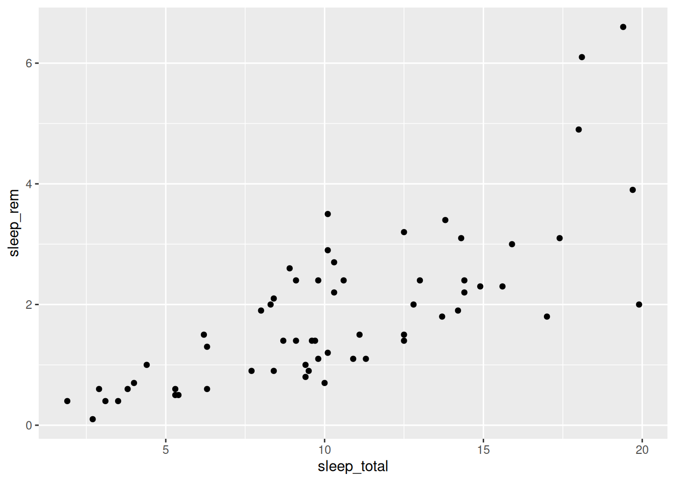
Figure 2.3: Scatterplot of mammal sleep times.
The code consists of three parts:
- Data: given by the first argument in the call to
ggplot:msleep. - Aesthetics: given by the second argument in the
ggplotcall:aes, where we mapsleep_totalto the x-axis andsleep_remto the y-axis. - Geoms: given by
geom_point, meaning that the observations will be represented by points.
At this point you may ask why on earth anyone would ever want to use ggplot2 code for creating plots. It’s a valid question. The base R code looks simpler and is consistent with other functions that we’ve seen. The ggplot2 code looks… different. This is because it uses the grammar of graphics, which in many ways is a language of its own, different from how we otherwise work with R.
But, the plot created using ggplot2 also looked different. It used filled circles instead of empty circles for plotting the points and had a grid in the background. In both base R graphics and ggplot2 we can change these settings, and many others. We can create something similar to the ggplot2 plot using base R as follows, using the pch argument and the grid function:
Some people prefer the look and syntax of base R plots, while others argue that ggplot2 graphics has a prettier default look. I can sympathise with both groups. Some types of plots are easier to create using base R, and some are easier to create using ggplot2. I like base R graphics for their simplicity and prefer them for quick-and-dirty visualisations as well as for more elaborate graphs where I want to combine many different components. For everything in between, including exploratory data analysis where graphics are used to explore and understand datasets, I prefer ggplot2. In this book, we’ll occasionally use base graphics for some quick-and-dirty plots, but put more emphasis on ggplot2 and how it can be used to explore data.
The syntax used to create the ggplot2 scatterplot was in essence ggplot(data, aes) + geom. All plots created using ggplot2 follow this pattern, regardless of whether they are scatterplots, bar charts or something else. The plus sign in ggplot(data, aes) + geom is important, as it implies that we can add more geoms to the plot, for instance a trend line, and perhaps other things as well. We will return to that shortly.
Unless the user specifies otherwise, the first two arguments to aes will always be mapped to the x and y axes, meaning that we can simplify the code above by removing the x = and y = bits (at the cost of a slight reduction in readability). Moreover, it is considered good style to insert a line break after the + sign. The resulting code is:
Note that this does not change the plot in any way; the difference is merely in the style of the code.
\[\sim\]
Exercise 2.12 Create a scatterplot with total sleep time along the x-axis and time awake along the y-axis (using the msleep data). What pattern do you see? Can you explain it?
2.7.2 Colours, shapes and axis labels
You now know how to make scatterplots, but if you plan to show your plot to someone else, there are probably a few changes that you’d like to make. For instance, it’s usually a good idea to change the label for the x-axis from the variable name “sleep_total” to something like “Total sleep time (h)”. This is done by using the + sign again, adding a call to labs to the plot:
Note that the plus signs must be placed at the end of a row rather than at the beginning. To change the y-axis label, add y = instead.
To change the colour of the points, you can set the colour in geom_point:
ggplot(msleep, aes(sleep_total, sleep_rem)) +
      geom_point(colour = "red") +
      labs(x = "Total sleep time (h)")
In addition to "red", there are a few more colours that you can choose from. You can run colours() in the Console to see a list of the 657 colours that have names in R (examples of which include "papayawhip", "blanchedalmond", and "cornsilk4"), or use colour hex codes like "#FF5733".
Alternatively, you may want to use the colours of the point to separate different categories. This is done by adding a colour argument to aes, since you are now mapping a data variable to a visual property. For instance, we can use the variable vore to show differences between herbivores, carnivores and omnivores:
ggplot(msleep, aes(sleep_total, sleep_rem, colour = vore)) +
      geom_point() +
      labs(x = "Total sleep time (h)")
You can change the legend label in labs:
ggplot(msleep, aes(sleep_total, sleep_rem, colour = vore)) +
      geom_point() +
      labs(x = "Total sleep time (h)",
           colour = "Feeding behaviour")
What happens if we use a continuous variable, such as the sleep cycle length sleep_cycle to set the colour?
ggplot(msleep, aes(sleep_total, sleep_rem, colour = sleep_cycle)) +
      geom_point() +
      labs(x = "Total sleep time (h)")
You’ll learn more about customising colours (and other parts) of your plots in Section 4.2.
\[\sim\]
Exercise 2.13 Using the penguins data, do the following:
Create a scatterplot with bill length along the x-axis and flipper length along the y-axis. Change the x-axis label to read “Bill length (mm)” and the y-axis label to “Flipper length (mm)”. Use
speciesto set the colour of the points.Try adding the argument
alpha = 1togeom_point, i.e.,geom_point(alpha = 1). Does anything happen? Try changing the1to0.75and0.25and see how that affects the plot.
(Click here to go to the solution.)
Exercise 2.14 Similar to how you changed the colour of the points, you can also change their size and shape. The arguments for this are called size and shape.
Change the scatterplot from Exercise 2.13 so that animals from different islands are represented by different shapes.
Then change it so that the size of each point is determined by the body mass, i.e., the variable
body_mass_g.
2.7.3 Axis limits and scales
Next, assume that we wish to study the relationship between animals’ brain sizes and their total sleep time. We create a scatterplot using:
ggplot(msleep, aes(brainwt, sleep_total, colour = vore)) +
      geom_point() +
      labs(x = "Brain weight",
           y = "Total sleep time")
There are two animals with brains that are much heavier than the rest (African elephant and Asian elephant). These outliers distort the plot, making it difficult to spot any patterns. We can try changing the x-axis to only go from 0 to 1.5 by adding xlim to the plot, to see if that improves it:
ggplot(msleep, aes(brainwt, sleep_total, colour = vore)) +
      geom_point() +
      labs(x = "Brain weight",
           y = "Total sleep time") +
      xlim(0, 1.5)
This is slightly better, but we still have a lot of points clustered near the y-axis, and some animals are now missing from the plot. If instead we wished to change the limits of the y-axis, we would have used ylim in the same fashion.
Another option is to rescale the x-axis by applying a log transform to the brain weights, which we can do directly in aes:
ggplot(msleep, aes(log(brainwt), sleep_total, colour = vore)) +
      geom_point() +
      labs(x = "log(Brain weight)",
           y = "Total sleep time")
This is a better-looking scatterplot, with a weak declining trend. We didn’t have to remove the outliers (elephants) to create it, which is good. The downside is that the x-axis now has become difficult to interpret. A third option that mitigates this is to add scale_x_log10 to the plot, which changes the scale of the x-axis to a \(\log_{10}\) scale (which increases interpretability because the values shown at the ticks still are on the original x-scale).
ggplot(msleep, aes(brainwt, sleep_total, colour = vore)) +
      geom_point() +
      labs(x = "Brain weight (logarithmic scale)",
           y = "Total sleep time") +
      scale_x_log10()
The numbers on the x-axis are displayed with scientific notation, where for instance 1e-04 means \(10^{-4}\). You can change the settings in R to use decimals, instead, using the options function as follows:
options(scipen = 1000)
ggplot(msleep, aes(brainwt, sleep_total, colour = vore)) +
      geom_point() +
      labs(x = "Brain weight (logarithmic scale)",
           y = "Total sleep time") +
      scale_x_log10()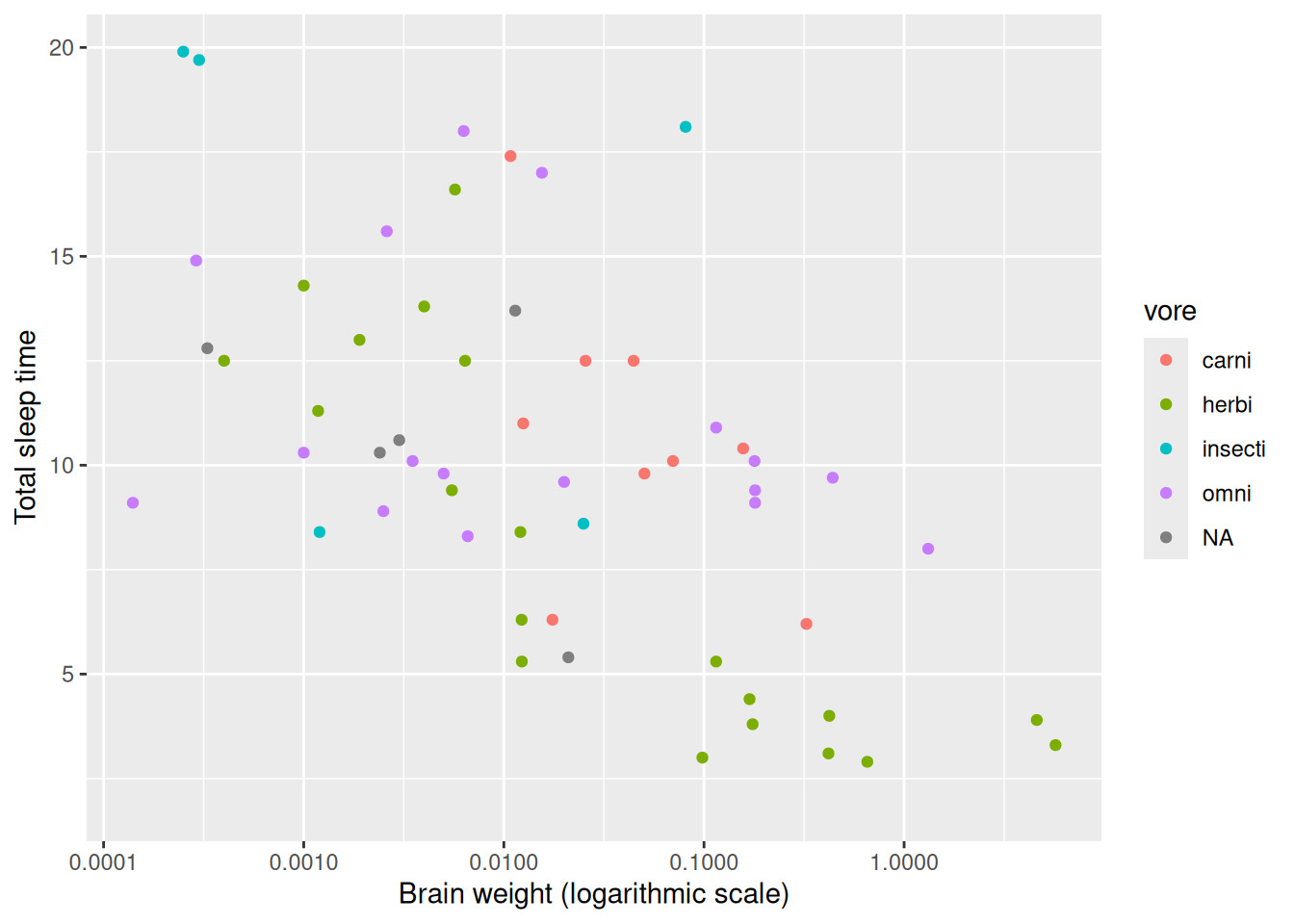
Figure 2.4: Example of a logarithmic x-axis.
\[\sim\]
Exercise 2.15 Using the msleep data, create a plot of log-transformed body weight versus log-transformed brain weight. Use total sleep time to set the colours of the points. Change the text on the axes to something informative.
2.7.4 Comparing groups
We frequently wish to make visual comparisons of different groups. One way to display differences between groups in plots is to use facetting, i.e., to create a grid of plots corresponding to the different groups. For instance, in our plot of animal brain weight versus total sleep time, we may wish to separate the different feeding behaviours (omnivores, carnivores, etc.) in the msleep data using facetting instead of different coloured points. In ggplot2 we do this by adding a call to facet_wrap to the plot:
ggplot(msleep, aes(brainwt, sleep_total)) +
      geom_point() +
      labs(x = "Brain weight (logarithmic scale)",
           y = "Total sleep time") +
      scale_x_log10() +
      facet_wrap(~ vore)
Note that the x-axes and y-axes of the different plots in the grid all have the same scale and limits.
\[\sim\]
Exercise 2.16 Using the penguins data, do the following:
Create a scatterplot with
bill_length_mmalong the x-axis andflipper_length_mmalong the y-axis, facetted byspecies.Read the documentation for
facet_wrap(?facet_wrap). How can you change the number of rows in the plot grid? Create the same plot as in part 1, but with 2 rows.
2.7.5 Boxplots
Another option for comparing groups is boxplots (also called box-and-whiskers plots). Using ggplot2, we create boxplots for animal sleep times, grouped by feeding behaviour, with geom_boxplot. Using base R, we use the boxplot function instead:
# Base R:
boxplot(sleep_total ~ vore, data = msleep)

# ggplot2:
ggplot(msleep, aes(vore, sleep_total)) +
      geom_boxplot()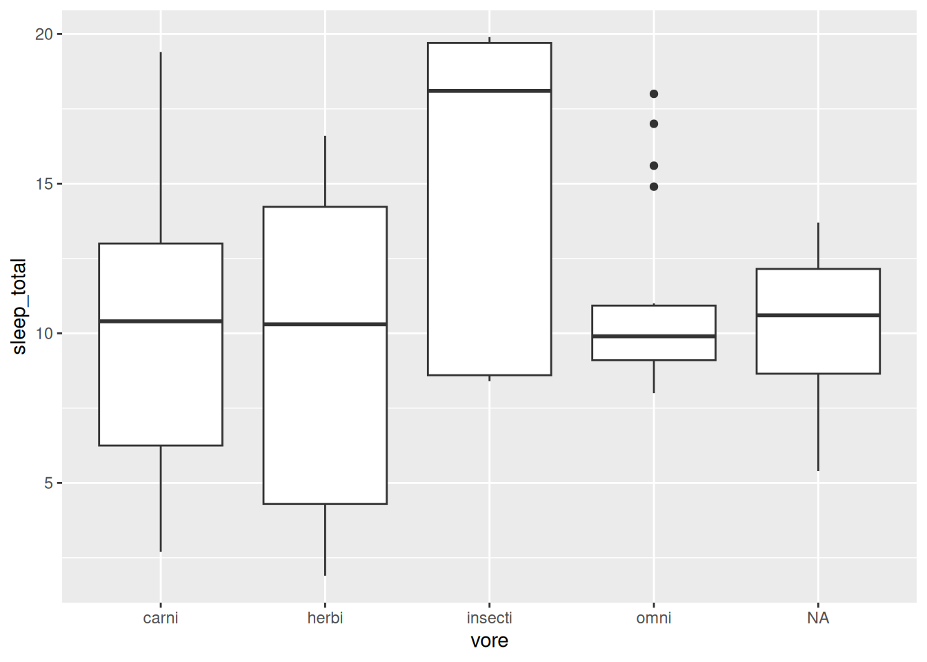
Figure 2.5: Boxplots showing mammal sleep times.
The boxes visualise important descriptive statistics for the different groups, similar to what we got using summary:
- Median: thick black line inside the box.
- First quartile: bottom of the box.
- Third quartile: top of the box.
- Minimum: end of the line (“whisker”) that extends from the bottom of the box.
- Maximum: end of the line that extends from the top of the box.
- Outliers: observations that deviate too much11 from the rest are shown as separate points. These outliers are not included in the computation of the median, quartiles and the extremes.
Note that just as for a scatterplot, the code consists of three parts:
- Data: given by the first argument in the call to
ggplot:msleep - Aesthetics: given by the second argument in the
ggplotcall:aes, where we map the group variablevoreto the x-axis and the numerical variablesleep_totalto the y-axis. - Geoms: given by
geom_boxplot, meaning that the data will be visualised with boxplots.
\[\sim\]
Exercise 2.17 Using the penguins data, do the following:
Create boxplots of bill lengths, grouped by
species.Read the documentation for
geom_boxplot. How can you change the colours of the boxes and their outlines?Add
geom_jitter(size = 0.5, alpha = 0.25)to the plot. What happens?
2.7.6 Histograms
To show the distribution of a continuous variable, we can use a histogram, in which the data is split into a number of bins, and the number of observations in each bin is shown by a bar. The ggplot2 code for histograms follows the same pattern as other plots, while the base R code uses the hist function:
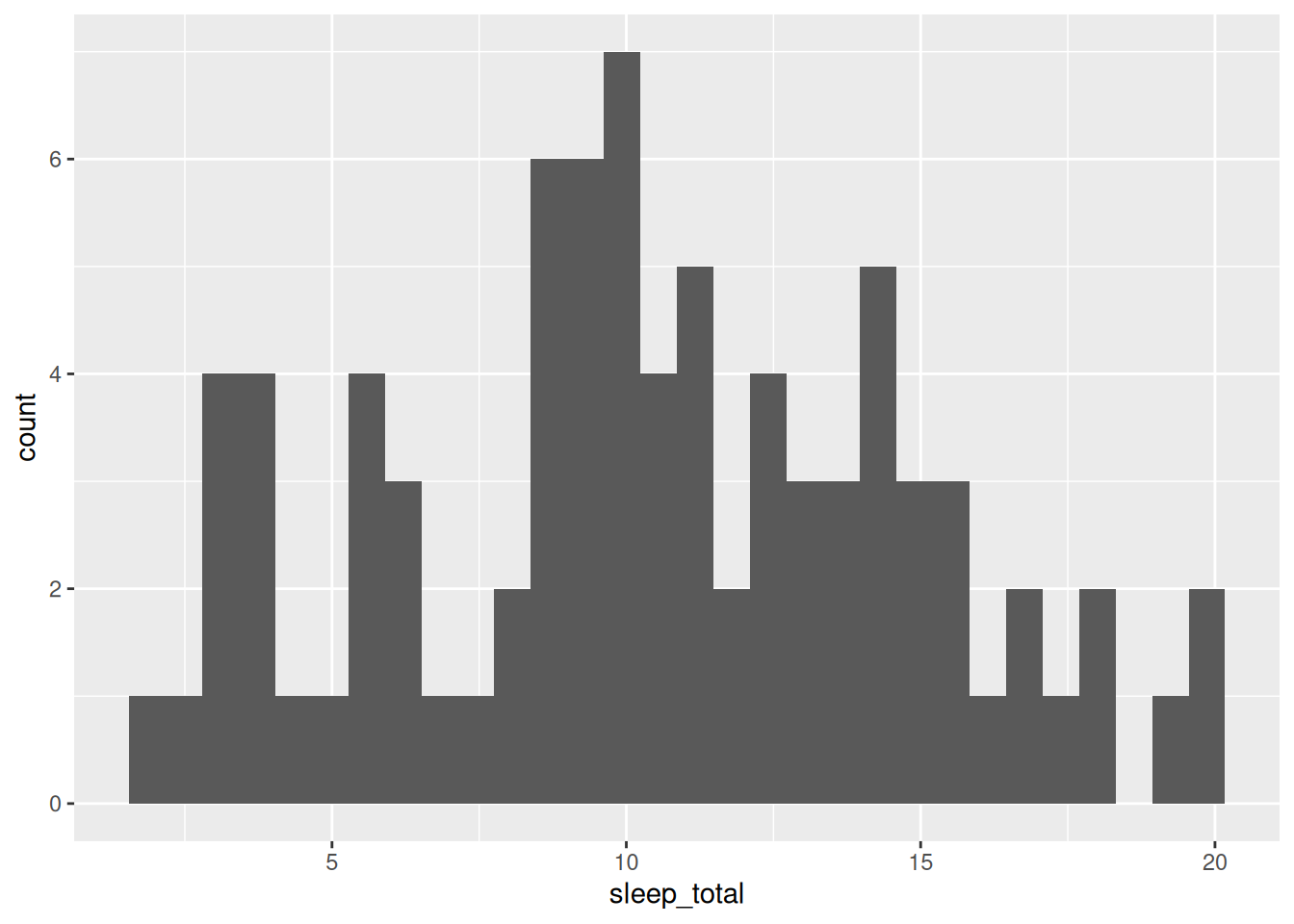
Figure 2.6: Histogram for mammal sleep times.
As before, the three parts in the ggplot2 code are:
- Data: given by the first argument in the call to
ggplot:msleep. - Aesthetics: given by the second argument in the
ggplotcall:aes, where we mapsleep_totalto the x-axis. - Geoms: given by
geom_histogram, meaning that the data will be visualised by a histogram.
\[\sim\]
Exercise 2.18 Using the penguins data, do the following:
Create a histogram of bill lengths.
Create histograms of bill lengths for different species, using facetting.
Add a suitable argument to
geom_histogramto add black outlines around the bars12.
2.8 Plotting categorical data
When visualising categorical data, we typically try to show the counts, i.e., the number of observations, for each category. The most common plot for this type of data is the bar chart.
2.8.1 Bar charts
Bar charts are discrete analogues to histograms, where the category counts are represented by bars. The code for creating them is:
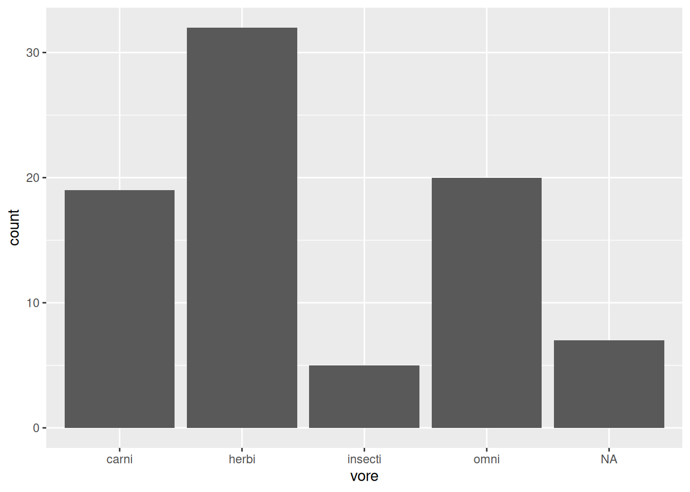
Figure 2.7: Bar chart for the mammal sleep data.
As always, the three parts in the ggplot2 code are:
- Data: given by the first argument in the call to
ggplot:msleep - Aesthetics: given by the second argument in the
ggplotcall:aes, where we mapvoreto the x-axis. - Geoms: given by
geom_bar, meaning that the data will be visualised by a bar chart.
To create a stacked bar chart using ggplot2, we map all groups to the same value on the x-axis and then map the different groups to different colours. This can be done using the following hack, where we use factor(1) to create a new variable that’s displayed on the x-axis:
\[\sim\]
Exercise 2.19 Using the penguins data, do the following:
Create a bar chart of species.
Add different colours to the bars by adding a
fillargument togeom_bar.Check the documentation for
geom_bar. How can you decrease the width of the bars?Return to the code you used for part 1. Add
fill = sexto theaes. What happens?Next, add
position = "dodge"togeom_bar. What happens?Add
coord_flip()to the plot. What happens?
2.9 Saving your plot
When you create a ggplot2 plot, you can save it as a plot object in R:
To plot a saved plot object, just write its name:
If you like, you can add things to the plot, just as before:
To save your plot object as an image file, use ggsave. The width and height arguments allows us to control the size of the figure (in inches, unless you specify otherwise using the units argument).
If you don’t supply the name of a plot object, ggsave will save the last ggplot2 plot you created.
In addition to pdf, you can save images, e.g., as jpg, tif, eps, svg, and png files, simply by changing the file extension in the filename. Alternatively, graphics from both base R and ggplot2 can be saved using the pdf and png functions, using dev.off to mark the end of the file:
pdf("filename.pdf", width = 5, height = 5) # Creates an empty pdf file
myPlot # Adds the plot to the pdf
dev.off() # Saves and closes the pdf

png("filename.png", width = 500, height = 500)
plot(msleep$sleep_total, msleep$sleep_rem)
dev.off()
Note that you also can save graphics by clicking on the Export button in the Plots pane in RStudio. Using code to save your plot is usually a better idea, because of reproducibility. At some point, you’ll want to go back and make changes to an old figure, and that will be much easier if you already have the code to export the graphic.
\[\sim\]
Exercise 2.20 Do the following:
Create a plot object and save it as a 4-by-4 inch png file.
When preparing images for print, you may want to increase their resolution. Check the documentation for
ggsave. How can you increase the resolution of your png file to 600 dpi?
(Click here to go to the solution.)
You’ve now had a first taste of graphics using R. We have, however, only scratched the surface and will return to the many uses of statistical graphics in Chapter 4.
2.10 Data frames and data types
2.10.1 Types and structures
We have already seen that different kinds of data require different kinds of statistical methods. For numeric data, we create boxplots and compute means, but for categorical data we don’t. Instead we produce bar charts and display the data in tables. It is no surprise then that R also treats different kinds of data differently.
In programming, a variable’s data type describes what kind of object is assigned to it. We can assign many different types of objects to the variable a: it could for instance contain a number, text, or a data frame. In order to treat a correctly, R needs to know what data type its assigned object has. In some programming languages, you have to explicitly state what data type a variable has, but not in R. This makes programming R simpler and faster, but can cause problems if a variable turns out to have a different data type than what you thought13.
R has six basic data types. For most people, it suffices to know about the first three in the list below:
numeric: numbers like1and16.823(sometimes also calleddouble).logical: true/false values (Boolean): eitherTRUEorFALSE.character: text, e.g.,"a","Hello! I'm Ada."and"name@domain.com".integer: integer numbers, denoted in R by the letterL:1L,55L.complex: complex numbers, like2+3i. Rarely used in statistical work.raw: used to hold raw bytes. Don’t fret if you don’t know what that means. You can have a long and meaningful career in statistics, data science, or pretty much any other field without ever having to worry about raw bytes. We won’t discussrawobjects again in this book.
In addition, these can be combined into special data types sometimes called data structures, examples of which include vectors and data frames. Important data structures include factor, which is used to store categorical data, and the awkwardly named POSIXct which is used to store date and time data.
To check what type of object a variable is, you can use the class function:
What happens if we use class on a vector?
class returns the data type of the elements of the vector. So what happens if we put objects of different types together in a vector?
In this case, R has coerced the objects in the vector to all be of the same type. Sometimes that is desirable, and sometimes it is not. The lesson here is to be careful when you create a vector from different objects. We’ll learn more about coercion and how to change data types in Section 5.1.
2.10.2 Types of tables
The basis for most data analyses in R are data frames: spreadsheet-like tables with rows and columns containing data. You encountered some data frames in previous examples. Have a quick look at them to remind yourself of what they look like:
# Bookstore example
age <- c(28, 48, 47, 71, 22, 80, 48, 30, 31)
purchase <- c(20, 59, 2, 12, 22, 160, 34, 34, 29)
bookstore <- data.frame(age, purchase)
View(bookstore)

# Animal sleep data
library(ggplot2)
View(msleep)
Notice that all three data frames follow the same format: each column represents a variable (e.g., age) and each row represents an observation (e.g., an individual). This is the standard way to store data in R (as well as the standard format in statistics in general). In what follows, we will use the terms column and variable interchangeably, to describe the columns/variables in a data frame.
This kind of table can be stored in R as different types of objects, i.e., in several different ways. As you’d expect, the different types of objects have different properties and can be used with different functions. Here’s the rundown of four common types:
matrix: a table where all columns must contain objects of the same type (e.g., allnumericor allcharacter). Uses less memory than other types and allows for much faster computations, but it is difficult to use for certain types of data manipulation, plotting and analyses.data.frame: the most common type, where different columns can contain different types (e.g., onenumericcolumn, onecharactercolumn).data.table: an enhanced version ofdata.frame.tbl_df(“tibble”): another enhanced version ofdata.frame.
First of all, in most cases it doesn’t matter which of these four you use to store your data. In fact, they all look similar to the user. Have a look at the following datasets (WorldPhones and airquality come with base R):
# First, an example of data stored in a matrix:
?WorldPhones
class(WorldPhones)
View(WorldPhones)

# Next, an example of data stored in a data frame:
?airquality
class(airquality)
View(airquality)

# Finally, an example of data stored in a tibble:
library(ggplot2)
?msleep
class(msleep)
View(msleep)
That being said, in some cases, it really matters which one you use. Some functions require that you input a matrix, while others may break or work differently from what was intended if you input a tibble instead of an ordinary data frame. Luckily, you can convert objects into other types:
WorldPhonesDF <- as.data.frame(WorldPhones)
class(WorldPhonesDF)

airqualityMatrix <- as.matrix(airquality)
class(airqualityMatrix)
\[\sim\]
Exercise 2.21 The following tasks are all related to data types and data structures:
Create a text variable using, e.g.,
a <- "A rainy day in Edinburgh". Check that it gets the correct type. What happens if you use single quotes marks instead of double quotes when you create the variable?What data types are the sums
1 + 2,1L + 2and1L + 2L?What happens if you add a
numericto acharacter, e.g.,"Hello" + 1?What happens if you perform mathematical operations involving a
numericand alogical, e.g.,FALSE * 2orTRUE + 1?
(Click here to go to the solution.)
Exercise 2.22 What do the functions ncol, nrow, dim, names, and row.names return when applied to a data frame?
(Click here to go to the solution.)
Exercise 2.23 matrix tables can be created from vectors using the function of the same name. Using the vector x <- 1:6 use matrix to create the following matrices:
\[\begin{pmatrix} 1 & 2 & 3\\ 4 & 5 & 6 \end{pmatrix}\]
and
\[\begin{pmatrix} 1 & 4\\ 2 & 5\\ 3 & 6 \end{pmatrix}.\]
Remember to check ?matrix to find out how to set the dimensions of the matrix, and how it is filled with the numbers from the vector!
2.11 Vectors in data frames
In the next few sections, we will explore the airquality dataset. It contains daily air quality measurements from New York during a period of 5 months:
Ozone: mean ozone concentration (ppb).Solar.R: solar radiation (Langley).Wind: average wind speed (mph).Temp: maximum daily temperature in degrees Fahrenheit.Month: numeric month (May=5, June=6, and so on).Day: numeric day of the month (1-31).
There are lots of things that would be interesting to look at in this dataset. What was the mean temperature during the period? Which day was the hottest? Which day was the windiest? What days was the temperature more than 90 degrees Fahrenheit? To answer these questions, we need to be able to access the vectors inside the data frame. We also need to be able to quickly and automatically screen the data in order to find interesting observations (e.g., the hottest day)
2.11.1 Accessing vectors and elements
In Section 2.6, we learned how to compute the mean of a vector. We also learned that to compute the mean of a vector that is stored inside a data frame14 we could use a dollar sign: data_frame_name$vector_name. Here is an example with the airquality data:
If we want to grab a particular element from a vector, we must use its index within square brackets: [index]. The first element in the vector has index 1, the second has index 2, the third has index 3, and so on. To access the fifth element in the Temp vector in the airquality data frame, we can use:
The square brackets can also be applied directly to the data frame. The syntax for this follows that used for matrices in mathematics: airquality[i, j] means the element at the i:th row and j:th column of airquality. We can also leave out either i or j to extract an entire row or column from the data frame. Here are some examples:
# First, we check the order of the columns:
names(airquality)
# We see that Temp is the 4th column.

airquality[5, 4]    # The 5th element from the 4th column,
                    # i.e. the same as airquality$Temp[5]
airquality[5,]      # The 5th row of the data
airquality[, 4]     # The 4th column of the data, like airquality$Temp
airquality[[4]]     # The 4th column of the data, like airquality$Temp
airquality[, c(2, 4, 6)] # The 2nd, 4th and 6th columns of the data
airquality[, -2]    # All columns except the 2nd one
airquality[, c("Temp", "Wind")] # The Temp and Wind columns
\[\sim\]
Exercise 2.24 The following tasks all involve using the [i, j] notation for extracting data from data frames:
Why does
airquality[, 3]not return the third row ofairquality?Extract the first five rows from
airquality. Hint: a fast way of creating the vectorc(1, 2, 3, 4, 5)is to write1:5.Compute the correlation between the
TempandWindvectors ofairqualitywithout referring to them using$.Extract all columns from
airqualityexceptTempandWind.
2.11.2 Adding and changing data using dollar signs
The $ operator can be used not just to extract data from a data frame, but also to manipulate it. Let’s return to our bookstore data frame and see how we can make changes to it using the dollar sign.
age <- c(28, 48, 47, 71, 22, 80, 48, 30, 31)
purchase <- c(20, 59, 2, 12, 22, 160, 34, 34, 29)
bookstore <- data.frame(age, purchase)
Perhaps there was a data entry error – the second customer was actually 18 years old and not 48. We can assign a new value to that element by referring to it in either of two ways:
We could also change an entire column if we like. For instance, if we wish to change the age vector to months instead of years, we could use
What if we want to add another variable to the data, for instance the length of the customers’ visits in minutes? There are several ways to accomplish this, one of which involves the dollar sign:
As you see, the new data has now been added to a new column in the data frame.
\[\sim\]
Exercise 2.25 Use the bookstore data frame to do the following:
Add a new variable
rev_per_minutewhich is the ratio between purchase and the visit length.Oh no, there’s been an error in the data entry! Replace the purchase amount for the 80-year-old customer with
16.
2.11.3 Filtering using conditions
A few paragraphs ago, we were asking which was the hottest day in the airquality data. Let’s find out! We already know how to find the maximum value in the Temp vector:
But can we find out which day this corresponds to? We could of course manually go through all 153 days, e.g., by using View(airquality), but that seems tiresome and wouldn’t even be possible in the first place if we’d had more observations. A better option is therefore to use the function which.max:
which.max returns the index of the observation with the maximum value. If there is more than one observation attaining this value, it only returns the first of these.
We’ve just used which.max to find out that day 120 was the hottest during the period. If we want to have a look at the entire row for that day, we can use
Alternatively, we could place the call to which.max inside the brackets. Because which.max(airquality$Temp) returns the number 120, this yields the same result as the previous line:
Were we looking for the day with the lowest temperature, we’d use which.min analogously. In fact, we could use any function or computation that returns an index in the same way, placing it inside the brackets to get the corresponding rows or columns. This is extremely useful if we want to extract observations with certain properties, for instance all days where the temperature was above 90 degrees. We do this using conditions, i.e., by giving statements that we wish to be fulfilled.
As a first example of a condition, we use the following, which checks if the temperature exceeds 90 degrees:
For each element in airquality$Temp this returns either TRUE (if the condition is fulfilled, i.e., when the temperature is greater than 90) or FALSE (if the condition isn’t fulfilled, i.e., when the temperature is 90 or lower). If we place the condition inside brackets following the name of the data frame, we will extract only the rows corresponding to those elements which were marked with TRUE:
If you prefer, you can also store the TRUE or FALSE values in a new variable. This creates a new variable indicating whether the condition is true or false:
If you don’t like the bracket notation that we used when we filtered our data using airquality[airquality$Temp > 90, ], you can try using the function subset instead. It achieves the same filtering with different syntax:
There are several logical operators and functions which are useful when stating conditions in R. Here are some examples:
a <- 3
b <- 8

a == b     # Check if a equals b
a > b      # Check if a is greater than b
a < b      # Check if a is less than b
a >= b     # Check if a is equal to or greater than b
a <= b     # Check if a is equal to or less than b
a != b     # Check if a is not equal to b
is.na(a)   # Check if a is NA
a %in% c(1, 4, 9) # Check if a equals at least one of 1, 4, 9
When checking a condition for all elements in a vector, we can use which to get the indices of the elements that fulfill the condition:
If we want to know if all elements in a vector fulfill the condition, we can use all:
In this case, it returns FALSE, meaning that not all days had a temperature above 90 (phew!). Similarly, if we wish to know whether at least one day had a temperature above 90, we can use any:
To find how many elements fulfill a condition, we can use sum:
Why does this work? Remember that sum computes the sum of the elements in a vector, and that when logical values are used in computations, they are treated as 0 (FALSE) or 1 (TRUE). Because the condition returns a vector of logical values, the sum of them becomes the number of 1s – the number of TRUE values – i.e., the number of elements that fulfill the condition.
To find the proportion of elements that fulfill a condition, we can count how many elements fulfill it and then divide by how many elements are in the vector. This is exactly what happens if we use mean:
Finally, we can combine conditions by using the logical operators & (AND), | (OR), and, less frequently, xor (exclusive or, XOR). Here are some examples:
a <- 3
b <- 8

# Is a less than b and greater than 1?
a < b & a > 1

# Is a less than b and equal to 4?
a < b & a == 4

# Is a less than b and/or equal to 4?
a < b | a == 4

# Is a equal to 4 and/or equal to 5?
a == 4 | a == 5

# Is a less than b XOR equal to 4?
# I.e. is one and only one of these satisfied?
xor(a < b, a == 4)
\[\sim\]
Exercise 2.26 The following tasks all involve checking conditions for the airquality data:
Which was the coldest day during the period?
How many days was the wind speed greater than 17 mph?
How many missing values are there in the
Ozonevector?How many days are there where the temperature was below 70 and the wind speed was above 10?
(Click here to go to the solution.)
Exercise 2.27 The function cut can be used to create a categorical variable from a numerical variable, by dividing it into categories corresponding to different intervals. Read its documentation and then create a new categorical variable in the airquality data, TempCat, which divides Temp into three intervals (50, 70], (70, 90], (90, 110]15.
2.12 Grouped summaries
Being able to compute the mean temperature for the airquality data during the entire period is great, but it would be even better if we also had a way to compute it for each month. The aggregate function can be used to create that kind of grouped summary.
To begin with, let’s compute the mean temperature for each month. Using aggregate, we do this as follows:
The first argument is a formula, saying that we want a summary of Temp grouped by Month. Similar formulas are used also in other R functions, for instance when building regression models. In the second argument, data, we specify in which data frame the variables are found, and in the third, FUN, we specify which function should be used to compute the summary.
By default, mean returns NA if there are missing values. In airquality, Ozone contains missing values, but when we compute the grouped means, the results are not NA:
By default, aggregate removes NA values before computing the grouped summaries.
It is also possible to compute summaries for multiple variables at the same time. For instance, we can compute the standard deviations (using sd) of Temp and Wind, grouped by Month:
aggregate can also be used to count the number of observations in the groups. For instance, we can count the number of days in each month. In order to do so, we put a variable with no NA values on the left-hand side in the formula, and use length, which returns the length of a vector:
Another function that can be used to compute grouped summaries is by. The results are the same, but the output is not as nicely formatted. Here’s how to use it to compute the mean temperature grouped by month:
What makes by useful is that unlike aggregate it is easy to use with functions that take more than one variable as input. If we want to compute the correlation between Wind and Temp grouped by month, we can do that as follows:
names(airquality)  # Check that Wind and Temp are in columns 3 and 4
by(airquality[, 3:4], airquality$Month, cor)
For each month, this outputs a correlation matrix, which shows both the correlation between Wind and Temp and the correlation of the variables with themselves (which always is 1).
\[\sim\]
Exercise 2.28 Install the datasauRus package using install.packages("datasauRus") (note the capital R!). It contains the dataset datasaurus_dozen. Check its structure and then do the following:
Compute the mean of
x, mean ofy, standard deviation ofx, standard deviation ofy, and correlation betweenxandy, grouped bydataset. Are there any differences between the 12 datasets?Make a scatterplot of
xagainstyfor each dataset (use facetting!). Are there any differences between the 12 datasets?
2.13 Using |> pipes
Consider the code you used to solve part 1 of Exercise 2.25:
Wouldn’t it be more convenient if you didn’t have to write the bookstore$ part each time? To just say once that you are manipulating bookstore, and have R implicitly understand that all the variables involved reside in that data frame? Yes. Yes, it would. Fortunately, R has tools that will let you do just that.
2.13.1 Ceci n’est pas une pipe
In most programming languages, data manipulation follows the same pattern as in the previous examples. In addition to that classic way of writing code, R offers an additional option: pipes. Pipes are operators that let you improve your code’s readability and restructure your code so that it is read from left to right instead of from the inside out. For this, we’ll use the dplyr package, which contains specialised functions that make it easier to use pipes for summarising, filtering and manipulating data. Let’s install it:
Let’s say that we are interested in finding out what the mean wind speed (in m/s rather than mph) on hot days (temperature above 80, say) in the airquality data is, aggregated by month. We could do something like this:
# Extract hot days:
airquality2 <- airquality[airquality$Temp > 80, ]
# Convert wind speed to m/s:
airquality2$Wind <- airquality2$Wind * 0.44704
# Compute mean wind speed for each month:
hot_wind_means <- aggregate(Wind ~ Month, data = airquality2,
                            FUN = mean)
There is nothing wrong with this code per se. We create a copy of airquality (because we don’t want to change the original data), change the units of the wind speed, and then compute the grouped means. A downside is that we end up with a copy of airquality that we maybe won’t need again. We could avoid that by putting all the operations inside of aggregate:
# More compact:
hot_wind_means <-  aggregate(Wind*0.44704 ~ Month,
                            data = airquality[airquality$Temp > 80, ],
                            FUN = mean)
The problem with this is that it is a little difficult to follow because we have to read the code from the inside out. When we run the code, R will first extract the hot days, then convert the wind speed to m/s, and then compute the grouped means; so the operations happen in an order that is the opposite of the order in which we wrote them.
R 4.1 introduced a new operator, |>, called a pipe, which can be used to chain functions together. Calls that you would otherwise write as
can be written as
so that the operations are written in the order they are performed. Some prefer the former style, which is more like mathematics, but many prefer the latter, which is more like natural language (particularly for those of us who are used to reading from left to right).
Three operations are required to solve the airquality wind speed problem:
- Extract the hot days.
- Convert the wind speed to m/s.
- Compute the grouped means.
Where before we used function-less operations like airquality2$Wind <- airquality2$Wind * 0.44704, we would now require functions that carried out the same operations if we wanted to solve this problem using pipes.
A function that lets us extract the hot days is filter from dplyr:
The dplyr function mutate lets us convert the wind speed:
Note that we don’t need to write airquality$Wind here; unless we specify otherwise, dplyr functions automatically assume that any variable names we reference are in the data frame that we provided as the first argument (much like the ggplot function).
And finally, the functions group_by and summarise can be used to compute the grouped means:
We could use these functions step-by-step:
# Extract hot days:
airquality2 <- filter(airquality, Temp > 80)
# Convert wind speed to m/s:
airquality2 <- mutate(airquality, Wind = Wind * 0.44704)
# Compute mean wind speed for each month:
airquality <- group_by(airquality, Month)
hot_wind_means <- summarise(airquality, Mean_wind_speed = mean(Wind))

hot_wind_means
But, because we have functions to perform the operations, we can instead use |> pipes to chain them together in a pipeline. Pipes automatically send the output from the previous function as the first argument to the next, so that the data flows from left to right, which makes the code more concise. The resulting code is:
airquality |>
      filter(Temp > 80) |>
      mutate(Wind = Wind * 0.44704) |>
      group_by(Month) |>
      summarise(Mean_wind_speed = mean(Wind)) ->
      hot_wind_means

hot_wind_means
You can read the |> operator as then: take the airquality data, then filter it, then convert the Wind variable, then specify the groups, then compute the grouped means. Once you wrap your head around the idea of reading the operations from left to right, this code is arguably clearer and easier to read. Note that we used the right-assignment operator -> to assign the result to hot_wind_means, to keep in line with the idea that the data flows from left to right.
If you look at older examples of R code, you’ll frequently find an alternative pipe operator used: %>%. This is an older implementation of the pipe, which still works (as long as either dplyr or the magrittr package is loaded) but is slower than |>.
A convenient way of writing the |> symbol in RStudio is to use the keyboard shortcut Ctrl+Shift+M. If this inserts the old %>% pipe, you need to go to the RStudio menu, click Tools > Global Options, choose the Code tab and tick the Use native pipe operator box.
In the remainder of the book, we will use pipes in some situations where they make the code easier to write or read. You’ll see plenty of examples of how pipes can be used in Chapters 3-11, and you will learn about other pipe operators in Section 6.2.
\[\sim\]
Exercise 2.29 Using the bookstore data:
age <- c(28, 48, 47, 71, 22, 80, 48, 30, 31)
purchase <- c(20, 59, 2, 12, 22, 160, 34, 34, 29)
visit_length <- c(5, 2, 20, 22, 12, 31, 9, 10, 11)
bookstore <- data.frame(age, purchase, visit_length)
Add a new variable rev_per_minute which is the ratio between purchase and the visit length, using a pipe and a function from dplyr.
2.13.2 Placeholders and with
A pipe sends the output from the left-hand side to the first argument of the right-hand function. This won’t work if the first argument of the right-hand function doesn’t agree with the output from the left-hand function.
An example of this is what happens when we try to compute the correlation between two variables in a data frame using a pipe:
The first argument of cor should be one of the variables to compute the correlation for, and not a data frame, which is what the pipe passes on. To use pipes with functions like this, we can wrap cor with the with function. This takes the data frame from the left-hand side as input and then applies cor to variables in that dataset:
There are some other functions that have an argument for passing a data frame, but not as their first argument. An example is aggregate. Its first argument is a formula specifying what variables we are interested in. We’ve previously used it as follows:
If we wanted to use it in a pipeline, we can do so by writing data = _ in the function’s arguments. In pipelines, _ is called a placeholder, and is a shorthand for “the output from the left-hand side of the pipe operator”.
2.14 Flavours of R: base and tidyverse
R is a programming language and just like any language, it has different dialects. When you read about R online, you’ll frequently see people mentioning the words “base” and “tidyverse”. These are the two most common dialects of R. Base R is just that, R in its purest form. The tidyverse is a collection of add-on packages for working with different types of data. The two are fully compatible, and you can mix and match as much as you like. Both ggplot2 and dplyr are part of the tidyverse, which is more tailored to using pipes.
In recent years, the tidyverse has been heavily promoted as being “modern” R which “makes data science faster, easier and more fun”. You should believe the hype: the tidyverse is marvellous. But if you only learn tidyverse R, you will miss out on much of what R has to offer. Base R is just as marvellous, and can definitely make data science as fast, easy and fun as the tidyverse. Besides, nobody uses just pure base R anyway – there are a ton of non-tidyverse packages that extend and enrich R in exciting new ways. Calling the non-tidyverse dialect “base” is a bit of a misnomer.
Anyone who tells you to just learn one of these dialects is wrong. Both are great, they work extremely well together, and they are similar enough that you shouldn’t limit yourself to just mastering one of them. This book will show you both base R and tidyverse solutions to problems, so that you can decide for yourself which is faster, easier, and more fun.
A defining property of the tidyverse is that there are separate functions for everything, which is perfect for code that relies on pipes. In contrast, base R uses fewer functions, but with more parameters, to perform the same tasks. If you use tidyverse solutions there is a good chance that there exists a function which performs exactly the task you’re going to do with its default settings. This is great (once again, especially if you want to use pipes), but it means that there are many more functions to master for tidyverse users, whereas you can make do with much fewer in base R. You will spend more time looking up function arguments when working with base R (which fortunately is fairly straightforward using the ? documentation); but, on the other hand, looking up arguments for a function that you know the name of is easier than finding a function that does something very specific that you don’t know the name of. There are advantages and disadvantages to both approaches.
2.15 Importing data
So far, we’ve looked at examples of data that either came shipped with base R or ggplot2 or palmerpenguins, or simple toy examples that we created ourselves, like bookstore. While you can do all your data entry work in R, bookstore style, it is much more common to load data from other sources. Two important types of files are comma-separated value files, .csv, and Excel spreadsheets, .xlsx. .csv files are spreadsheets stored as text files – basically Excel files stripped down to the bare minimum – no formatting, no formulas, no macros. You can open and edit them in spreadsheet software like LibreOffice Calc, Google Sheets, or Microsoft Excel. Many devices and databases can export data in .csv format, making it a commonly used file format that you are likely to encounter sooner rather than later.
2.15.2 Importing csv files
In order to manually load data from a file into R, you need its path, i.e, you need to tell R where to find the file. Unless you specify otherwise, R will look for files in its current working directory. To see what your current working directory is, run the following code in the Console pane:
In RStudio, your working directory will usually be shown in the Files pane. If you have opened RStudio by opening a .R file, the working directory will be the directory in which the file is stored. You can change the working directory by using the function setwd or selecting Session > Set Working Directory > Choose Directory in the RStudio menu.
Before we discuss paths further, let’s look at how you can import data from a file that is in your working directory. The data files that we’ll use in examples in this book can be downloaded from the book’s web page. They are stored in a zip file (data.zip); open it and copy/extract the files to the folder that is your current working directory. Open philosophers.csv with a spreadsheet software to have a quick look at it. Then open it in a text editor (for instance, Notepad for Windows, TextEdit for Mac or Gedit for Linux). Note how commas are used to separate the columns of the data:
"Name","Description","Born","Deceased","Rating"
"Aristotle","Pretty influential, as philosophers go.",-384,"322 BC",
"4.8"
"Basilides","Denied the existence of incorporeal entities.",-175,
"125 BC",4
"Cercops","An Orphic poet",,,"3.2"
"Dexippus","Neoplatonic!",235,"375 AD","2.7"
"Epictetus","A stoic philosopher",50,"135 AD",5
"Favorinus","Sceptic",80,"160 AD","4.7"Then run the following code to import the data using the read.csv function and store it in a variable named imported_data:
If you get an error message that says:
Error in file(file, "rt") : cannot open the connection
In addition: Warning message:
In file(file, "rt") :
  cannot open file 'philosophers.csv': No such file or directory
…it means that philosophers.csv is not in your working directory. Either move the file to the right directory (remember, you can use run getwd() to see what your working directory is) or change your working directory, as described above.
Now, let’s have a look at imported_data:
The columns Name and Description both contain text, and have been imported as character vectors16. The Rating column contains numbers with decimals and has been imported as a numeric vector. The column Born only contain integer values and has been imported as an integer vector. The missing value is represented by an NA. The Deceased column contains years formatted like 125 BC and 135 AD. These have been imported into a character vector – because numbers and letters are mixed in this column, R treats it as a text string (in Chapter 5 we will see how we can convert it to numbers or proper dates). In this case, the missing value is represented by an empty string, "", rather than by NA.
So, what can you do in case you need to import data from a file that is not in your working directory? This is a common problem, as many of us store script files and data files in separate folders (or even on separate drives). One option is to use file.choose, which opens a pop-up window that lets you choose which file to open using a graphical interface:
This is fine if you just want to open a single file once. But if you want to reuse your code or run it multiple times, you probably don’t want to have to click and select your file each time. Instead, you can specify the path to your file in the call to read.csv.
2.15.3 File paths
File paths look different in different operating systems. If the user Mans has a file named philosophers.csv stored in a folder called MyData on his desktop, its path on an English-language Windows system would be:
On a Mac, it would be:
And on Linux:
You can copy the path of the file from your file browser: Explorer17 (Windows), Finder18 (Mac) or Nautilus/similar19 (Linux). Once you have copied the path, you can store it in R as a character string.
Here’s how to do this on Mac and Linux:
file_path <- "/Users/Mans/Desktop/MyData/philosophers.csv" # Mac
file_path <- "/home/Mans/Desktop/MyData/philosophers.csv"  # Linux
If you’re working on a Windows system, file paths are written using backslashes, \, like so:
You have to be careful when using backslashes in character strings in R, because they are used to create special characters (see Section 5.5). If we place the above path in a string, R won’t recognise it as a path. Instead, we have to reformat it into one of the following two formats:
# Windows example 1:
file_path <- "C:/Users/Mans/Desktop/MyData/philosophers.csv"
# Windows example 2:
file_path <- "C:\\Users\\Mans\\Desktop\\MyData\\philosophers.csv"
If you’ve copied the path to your clipboard, you can also get the path in the second of the formats above by using
Once the path is stored in file_path, you can then make a call to read.csv to import the data:
Try this with your philosophers.csv file, to make sure that you know how it works.
Finally, you can read a file directly from a URL, by giving the URL as the file path. Here is an example with data from the WHO Global Tuberculosis Report:
.csv files can differ slightly in how they are formatted – for instance, different symbols can be used to delimit the columns. You will learn how to handle this in the exercises below.
A downside to read.csv is that it is very slow when reading large (50 MB or more) csv files. Faster functions are available in add-on packages; see Section 5.7.1. In addition, it is also possible to import data from other statistical software packages, such as SAS and SPSS, from other file formats like JSON, and from databases. We’ll discuss most of these in Section 5.14.
2.15.4 Importing Excel files
One common file format we will discuss right away though – .xlsx – Excel spreadsheet files. There are several packages that can be used to import Excel files to R. I like the openxlsx package, so let’s install that:
Now, download the philosophers.xlsx file from the book’s web page and save it in a folder of your choice. Then, set file_path to the path of the file, just as you did for the .csv file. To import data from the Excel file, you can then use:
library(openxlsx)
imported_from_Excel <- read.xlsx(file_path)

View(imported_from_Excel)
str(imported_from_Excel)
As with read.csv, you can replace the file path with file.choose() in order to select the file manually.
\[\sim\]
Exercise 2.30 The abbreviation CSV stands for comma separated values, i.e., that commas , are used to separate the data columns. Unfortunately, the .csv format is not standardised, and .csv files can use different characters to delimit the columns. Examples include semicolons (;) and tabs (multiple spaces, denoted \t in strings in R). Moreover, decimal points can be given either as points (.) or as commas (,). Download the vas.csv file from the book’s web page. In this dataset, a number of patients with chronic pain have recorded how much pain they experience each day during a period, using the visual analogue scale (VAS, ranging from 0 – no pain – to 10 – worst imaginable pain). Inspect the file in a spreadsheet software and a text editor; check which symbol is used to separate the columns and whether a decimal point or a decimal comma is used. Then set file_path to its path and import the data from it using the code below:
Why are there two variables named
XandX.1in the data frame?What happens if you remove the
sep = ";"argument?What happens if you instead remove the
dec = ","argument?What happens if you instead remove the
skip = 4argument?What happens if you change
skip = 4toskip = 5?
(Click here to go to the solution.)
Exercise 2.31 Load the VAS pain data vas.csv from Exercise 2.30. Then do the following:
Compute the mean VAS for each patient.
Compute the lowest and highest VAS recorded for each patient.
Compute the number of high-VAS days, defined as days where the VAS was at least 7, for each patient.
(Click here to go to the solution.)
Exercise 2.32 Download the projects-email.xlsx file from the book’s web page and have a look at it in a spreadsheet software. Note that it has three sheets: Projects, Email, and Contact.
Read the documentation for
read.xlsx. How can you import the data from the second sheet, Email?Some email addresses are repeated more than once. Read the documentation for
unique. How can you use it to obtain a vector containing the email addresses without any duplicates?
(Click here to go to the solution.)
Exercise 2.33 Download the vas-transposed.csv file from the book’s web page and have a look at it in a spreadsheet software. It is a transposed version of vas.csv, where rows represent variables and columns represent observations (instead of the other way around, as is the case in data frames in R). How can we import this data into R?
Import the data using
read.csv. What does the resulting data frame look like?Read the documentation for
read.csv. How can you make it read the row names that can be found in the first column of the.csvfile?The function
tcan be applied to transpose (i.e., rotate) your data frame. Try it out on your imported data. Is the resulting object what you were looking for? What happens if you make a call toas.data.framewith your data after transposing it?
2.16 Saving and exporting your data
In many a case, data manipulation is a huge part of statistical work, and of course you want to be able to save a data frame after manipulating it. There are two options for doing this in R: you can either export the data as, e.g., a .csv or a .xlsx file, or save it in R format as an .RData file.
2.16.1 Exporting data
Just as we used the functions read.csv and read.xlsx to import data, we can use write.csv and write.xlsx to export it. The code below saves the bookstore data frame as a .csv file and an .xlsx file. Both files will be created in the current working directory. If you wish to store them somewhere else, you can replace the "bookstore.csv" bit with a full path, e.g., "/home/mans/my-business/bookstore.csv".
2.16.2 Saving and loading R data
Being able to export to different spreadsheet formats is very useful, but sometimes you want to save an object that can’t be saved in a spreadsheet format. For instance, you may wish to save a machine learning model that you’ve created. .RData files can be used to store one or more R objects.
To save the objects bookstore and age in a .Rdata file, we can use the save function:
To save all objects in your environment, you can use save.image:
When we wish to load the stored objects, we use the load function:
2.17 RStudio projects
It is good practice to create a new folder for each new data analysis project that you are working on, where you store code, data, and the output from the analysis. In RStudio you can associate a folder with a Project, which lets you start RStudio with that folder as your working directory. Moreover, by opening another Project you can have several RStudio sessions, each with its separate variables and working directories, running simultaneously.
To create a new Project, click File > New Project in the RStudio menu. You then get to choose whether to create a Project associated with a folder that already exists, or to create a Project in a new folder. After you’ve created the Project, it will be saved as an .Rproj file. You can launch RStudio with the Project folder as the working directory by double-clicking the .Rproj file. If you already have an active RStudio session, this will open another session in a separate window.
When working in a Project, I recommend that you store your data in a subfolder of the Project folder. You can then use relative paths to access your data files, i.e., paths that are relative to your working directory. For instance, if the file bookstore.csv is in a folder in your working directory called Data, its relative path is:
Much simpler than having to write the entire path, isn’t it?
If instead your working directory is contained inside the folder where bookstore.csv is stored, its relative path would be
The beauty of using relative paths is that they are simpler to write, and if you transfer the entire project folder to another computer, your code will still run, because the relative paths will stay the same.
2.18 Troubleshooting
Every now and then R will throw an error message at you. Sometimes, these will be informative and useful, as in this case:
where R prints:
This tells us that the function that we are trying to use, means, does not exist. There are two possible reasons for this: either we haven’t loaded the package in which the function exists, or we have misspelt the function name. In our example, the latter is true; the function that we really wanted to use was of course mean and not means.
At other times, interpreting the error message seems insurmountable, like in these examples:
Error in if (str_count(string = f[[j]], pattern = \"\\\\S+\") == 1) { :
  \n  argument is of length zero
and
When you encounter an error message, I recommend following these steps:
Read the error message carefully and try to decipher it. Have you seen it before? Does it point to a particular variable or function? Check Section 13.2 of this book, which deals with common error messages in R.
Check your code. Have you misspelt any variable or function names? Are there missing brackets, strange commas, or invalid characters?
Copy the error message and do a web search using the message as your search term. It is more than likely that somebody else has encountered the same problem, and that you can find a solution to it online. This is a great shortcut for finding solutions to your problem. In fact, this may well be the single most important tip in this entire book.
Read the documentation for the function causing the error message, and look at some examples of how to use it (both in the documentation and online, e.g., in blog posts). Have you used it correctly?
Use the debugging tools presented in Chapter 13, or try to simplify the example that you are working with (e.g., removing parts of the analysis or the data) and see if that removes the problem.
If you still can’t find a solution, post a question at a site like Stack Overflow or the RStudio community forums. Make sure to post your code and describe the context in which the error message appears. If at all possible, post a reproducible example, i.e., a piece of code that others can run, that causes the error message. This will make it a lot easier for others to help you.
For many Linux distributions, R is also available from the package management system.↩︎
In addition to the version number, each release of R has a nickname referencing a Peanuts comic by Charles Schulz.↩︎
The word “manipulate” has different meanings. Just to be perfectly clear: whenever I speak of manipulating data in this book, I will mean handling and transforming the data, not tampering with it.↩︎
If you are used to programming languages like C or Java, you should note that R is dynamically typed, meaning that the data type of an R variable also can change over time. This also means that there is no need to declare variable types in R (which is either liberating or terrifying, depending on what type of programmer you are).↩︎
In RStudio, you can also create the assignment operator
<-by using the keyboard shortcut Alt+- (i.e., press Alt and the - button at the same time).↩︎Specifically, the period is used to separate methods and classes in object-oriented programming, which is hugely important in R (although you can use R for several years without realising this).↩︎
I find myself using screaming snake case on occasion. Make of that what you will.↩︎
I recommend
snake_caseorcamelCase, just in case that wasn’t already clear.↩︎The use of
librarycauses people to erroneously refer to R packages as libraries. Think of the library as the place where you store your packages, and callinglibrarymeans that you go to your library to fetch the package.↩︎The first quartile is a value such that 25% of the observations are smaller than it; the third quartile is a value such that 25% of the observations are larger than it.↩︎
In this case, too much means that they are more than 1.5 times the height of the box away from the edges of the box.↩︎
Personally, I don’t understand why anyone would ever plot histograms without outlines!↩︎
And the subsequent troubleshooting makes programming R more difficult and slower.↩︎
This works regardless of whether this is a regular
data.frame, adata.tableor a tibble.↩︎In interval notation,
(50, 70]means that the interval contains all values between 50 and 70, excluding 50 but including 70; the intervals is open on the left but closed to the right.↩︎If you are running an older version of R (specifically, a version older than the 4.0.0 version released in April 2020), the
charactervectors will have been imported asfactorvectors instead. You can change that behaviour by adding astringsAsFactors = FALSEargument toread.csv.↩︎To copy the path, navigate to the file in Explorer. Hold down the Shift key and right-click the file, selecting Copy as path.↩︎
To copy the path, navigate to the file in Finder and right-click/Control+click/two-finger click on the file. Hold down the Option key, and then select Copy “file name” as Pathname.↩︎
To copy the path from Nautilus, navigate to the file and press Ctrl+L to show the path, then copy it. If you are using some other file browser or the terminal, my guess is that you’re tech-savvy enough that you don’t need me to tell you how to find the path of a file.↩︎